Principles of Design: Negative Space
2019-03-25Negative space is the blank area around, inside, or between the elements of a design. It’s not the star of the show, but great design cannot exist without it.
Introduction to Negative Space
Mozart famously said “The music is not in the notes, but in the silence between.” This quote brilliantly gives credit where it’s due. Without breaks of silence, music would simply be a steady stream of unpleasant noise.
In much of the same way, a beautiful and functional UI is the result of thoughtful and intentional use of negative space.
Negative space is the blank area around, inside, or between the elements of a design. It’s not the star of the show, but great design cannot exist without it.

You wouldn’t be able to read this lesson if it wasn’t for the negative space around each letter. The space between each word creates distinction. Each line of text is separated with just enough space to indicate a relationship with the text above and below. Even more space is added between paragraphs to indicate that a new idea or point is being made.
These same ideas apply to other UI elements as well.
The negative space around a logo, for example, is carefully considered to ensure that the integrity of its design isn’t compromised at a small scale. The space between UI elements can be used to indicate a relationship or distinction, depending on how much is applied.
It’s not too uncommon to hear designers refer to negative space as “breathing room” or “negative space.” However, negative space also has many technical names, including padding, margin, kerning, tracking (letter spacing), and leading (line height).
In this lesson, we’ll discuss how to use each type of negative space in UI Design.
Why is Negative Space Important?
There are seven primary reasons we use negative space in design:
1. Improves focus
As mentioned in the Emphasis Lesson, “The fewer elements you have on a page, the easier it for your reader to understand what you intended to communicate.”
Fewer elements competing for attention results in more negative space. More negative space makes it easier to focus on those elements.
2. Improves comprehension
A study by D.Y.M. Lin concluded that the “use of negative space between paragraphs and in the left and right margins increased comprehension by almost 20%.”
3. Helps create balance
Elements of different visual weight can be balanced asymmetrically by controlling the amount of negative space around each element.
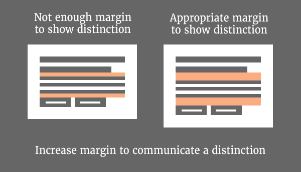
4. Communicates distinction
Gratuitous amounts of negative space (macro) can be applied to indicate a clear distinction between elements.
5. Communicates relationships
A smaller amount of negative space (micro) can be applied to indicate a relationship between elements.
6. Helps to establish visual hierarchy
A combination of macro and micro negative space can be used to help establish visual hierarchy in your design.
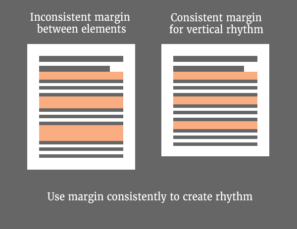
7. Promotes rhythm in your design
Just as notes and silence work together to create rhythm in music, elements and negative space work together to create rhythm in your UI. A consistent spacing strategy helps users adapt to the design and understand and anticipate the flow.
Create a System for Spacing
Negative space is one of the most difficult principles to master for anyone just getting started with design. Many would argue that negative space is more of an art than a science.
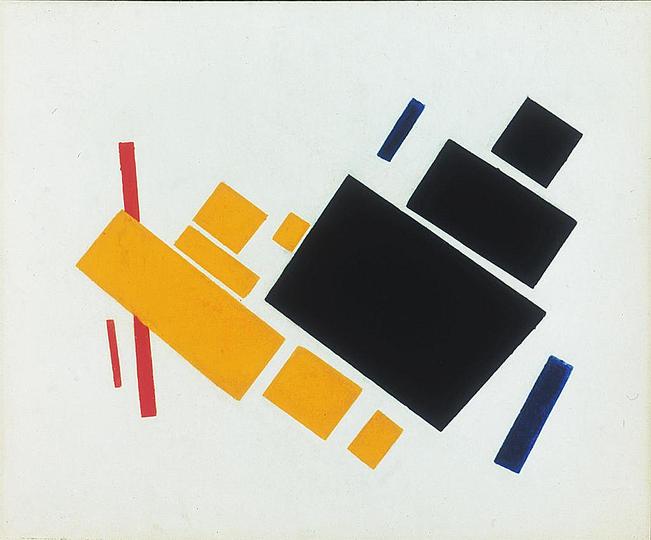
Painting by Kazimir Malevich
An artist can rely on his or her trained eye and intuition to create a balanced composition without tools to measure negative space. However, in UI Design, optically spacing everything can also lead to inconsistencies and a lack of rhythm.
The best approach to using negative space in UI Design is both an art AND a science. Many of the concepts below were inspired by this article from Nathan Curtis.
Linear Progression
In the Proportion Lesson, we discussed how to use the 8pt Grid System to determine the size of UI elements. This approach can also be used to determine the amount of negative space to apply by sticking to multiples of 8pt.
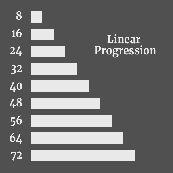
This strategy offers a range of micro to macro spacing options to use in your design, which makes decisions about spacing much easier.
One drawback, however, is that a linear scale can arguably result in too many options. Deciding when to use 16pt vs 24pt vs 32pt, for example, can boil down to a difference of opinion between individuals on a team and lead to inconsistency.
Non-Linear Progression
Rather than incrementing by a base number, a non-linear progression scales at a rate that further limits your spacing of options.
For example, a non-linear progression that works with an 8pt Grid System is to start with your base, multiply by two, and continue multiplying the result by two until you have a full range of options.
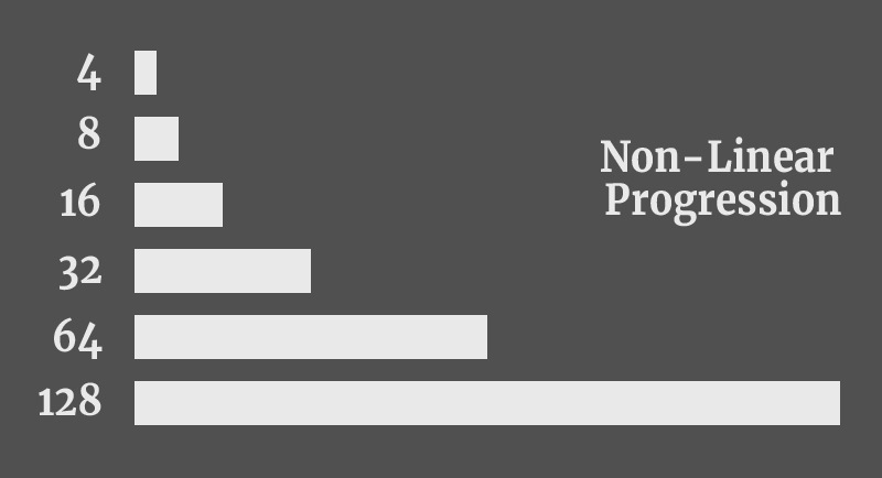
Note: 4pt is included per the Material Design Spec for cases dealing with typography and icons.
While this does severely limit your spacing options, it’s much easier for a team of designers to agree when to use 16pt vs 32pt without another option in between.
“The enemy of art is the absence of limitations.”
- Orson Welles
Other methods, such as the Golden Ratio, can also be used to create a non-linear progression.
Optical Spacing
Spacing techniques, such as linear or non-linear progression can certainly help bring consistency and rhythm to your UI, but it doesn’t guarantee that your design will always look right. In cases where none of your spacing options seem to work, the only alternative is to space things optically.
Optical spacing is more or less the “art” side of the spacing system.
In lesson 2, we discussed how balance is affected by both density and emphasis. With this in mind, sometimes we have to optically adjust elements to ensure the overall design remains balanced.
An example of this can be found at the end of the Alignment Lesson of this course.
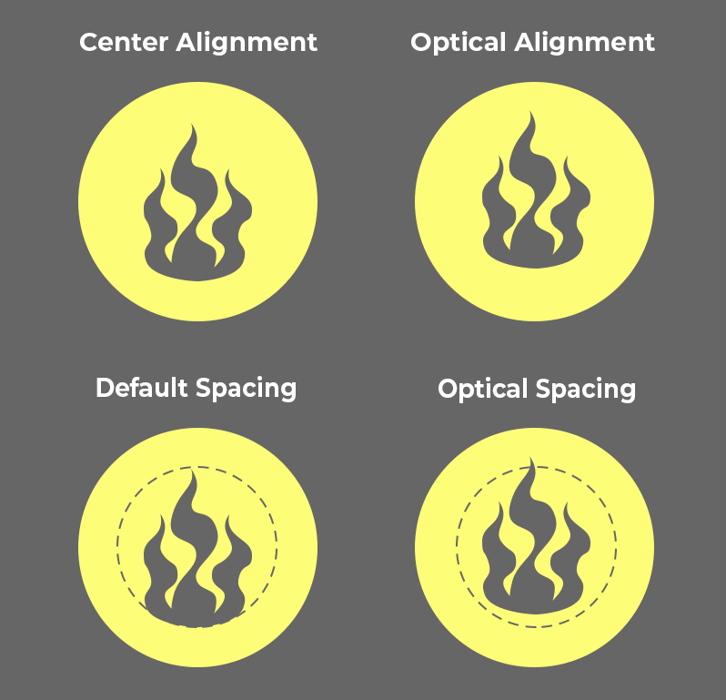
In that particular case, we focused on the icon and it’s alignment with the circle. However, if we switch our focus to the negative space around the icon, we’ll see that it’s evenly distributed and balanced as well. We’ve achieved optical alignment, optical spacing, and balance simultaneously.
Note: Negative space does not have to be white. It can be any color, texture, or image that is behind the focal point of your design.
Determining the “Right” Amount of Negative Space
It’s possible to have too much or not enough negative space, so how do we determine the right amount?
Tip #1 - Empathic Spacing
Remember that you are not designing for your own visual comfort. Approach negative space with empathy. Anyone that sees your UI for the first time will not perceive it the same way you do. They will not know where to find everything in your UI like you can. For this reason, proper spacing is critical to help your user find his or her way around your UI.
Look at the whole design and asses the spacing from an “overall” perspective. It might sound strange, but try blurring your vision by squinting or slightly crossing your eyes. If you find it difficult to make the distinction between elements, then you probably do not have enough negative space.
Play it safe. If you’re unsure about the amount of negative space you have, add more. It’s better to have a little too much than not enough.
Tip #2 - Start With Too Much Negative Space
A great tip that comes from UI Designer, Steve Schoger in the book Refactoring UI, is to start with too much negative space.
“When designing for the web, negative space is almost always added to a design … The problem with this approach is that elements are only given the minimum amount of breathing room to not look actively bad. To make something actually look good, you usually need more negative space. A better approach is to start by giving something way too much negative space, then remove it until you’re happy with the result.”
This tip ensures that your are not simply meeting the “minimum requirement” for negative space in a design. There is likely a range of spacing that you’ll be comfortable with. It’s better to err on the side of “too much” than “not enough.”
Negative Space for UI Elements
When designing UI Elements (or components), there are two types of negative space that you will use: padding and margin.
Both types of spacing are used in web development to style web pages, so understanding the difference between them makes communication easier between designers and developers. For a more technical comparison between the two, read Padding vs Margin: The Definitive Guide.
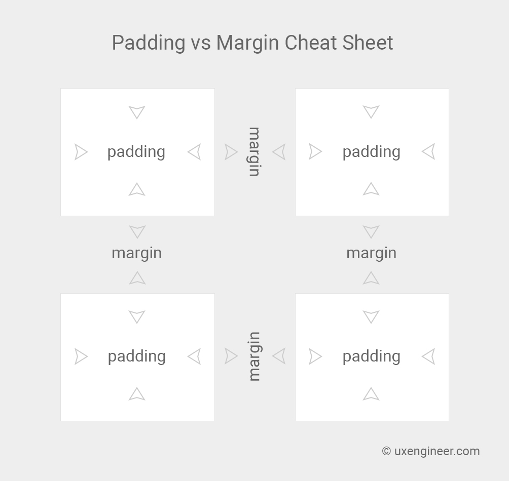
As the name suggests, padding is the space that “pads” the inside of a containing element. In other words, padding pushes content inward from the top, bottom, left or right side of a container.
The space between UI elements is margin. Unlike padding, margin creates negative space on the outside of an element. In other words, margin pushes other content away from the top, bottom, left or right side.
Guidelines for Padding and Margin
As mentioned previously, understanding how to effectively use negative space can be a challenge. The following guidelines can help.
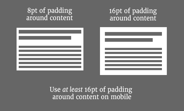
On mobile devices, a containing element needs at least 16pt of padding, according to Google Material Design.
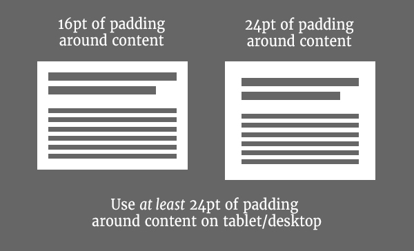
On tablet or desktop devices, a containing elements needs at least 24pts of padding, according to Google Material Design *
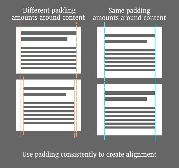
Apply the same amount of padding on the left and right sides of your containing elements to keep all of your content horizontally aligned.
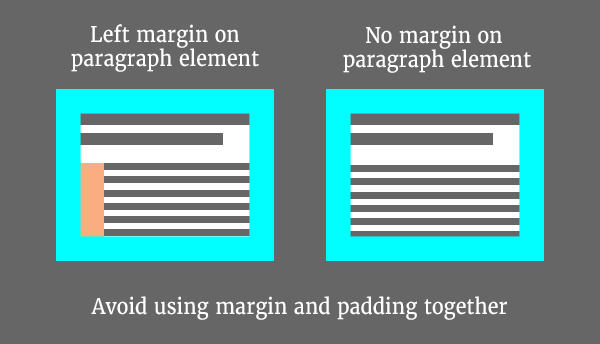
Avoid combining margin and padding together to create negative space (read The Down-Right Margin Method below).
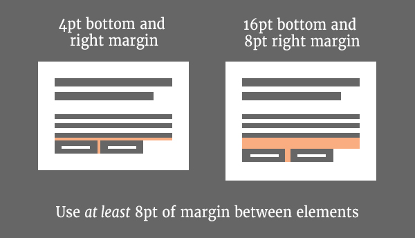
Most UI Elements should have a minimum of 8pts of margin between them, according to Google Material Design.
Don’t use too much margin between two elements that are related.
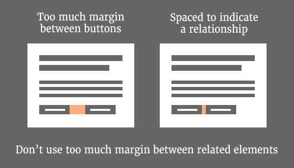
Increase margin to communicate a distinction between two elements or groups of elements.
Use margin in a consistent way to establish vertical and horizontal rhythm.
Note: If you use the non-linear progression outlined in the “Create a System for Spacing” section of this lesson, you’ll notice that 24pt is not an option. In this particular case, 32pts might be more suitable.
Down-Right Margin Method (for Developers)
On the web, UI components are either stacked on top of each other (aka block elements) or inline with each other. Without any margin or padding applied, the default position of an element is to the top-left of its container.
As a result, a web developer can use margin-right for all inline elements and margin-bottom for all stacked elements, without ever needing to apply margin to the top or left side of an element.
Top and left margin is usually unnecessary because elements are already pushed away from the top and left of their container with padding.
In lesson 3, we discussed the importance of alignment. By adopting the Down-Right Margin Method, you can ensure that your content is always vertically and horizontally aligned.
Any use of top or left margin on an element will cause misalignment unless the same is applied to all remaining elements.
However, there are two things to keep in mind:
Avoid using em units for margin and padding because they are measured relative to font size. To guarantee consistent spacing throughout your UI, it’s better to use pixels or rems for both margin and padding
Pair right or bottom margin with
:last-of-type \{margin: none\}orlast-child {margin: none;}to ensure that your margin never touches the right and bottom padding of the container.
Negative Space for Typography
Typography possesses properties that other UI elements do not have, such as ascenders, descenders, x-height, cap height, leading, letter-spacing, aperture, stems, strokes, serifs, and baseline (whew).
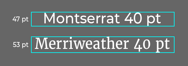
To make matters more complicated, all of these properties vary depending on the font-family and font-sizes you choose. In this way, UI design elements and typography are very different from each other.
For example, a font-size of 40px does not produce text that is 40px tall. In fact, 40px will result in a range computed heights, depending on the font-family you choose. Check out this article for a more technical breakdown about this topic.
Despite these quirks, we do have some control over the negative space in our typography - in particular, kerning, tracking (letter spacing), and leading (line-height).
Kerning
Kerning is the optical adjustment of the negative space between two letters. Without kerning, many letter combinations, such as ‘AV’ or ‘Te’ would appear to be awkwardly spaced apart.
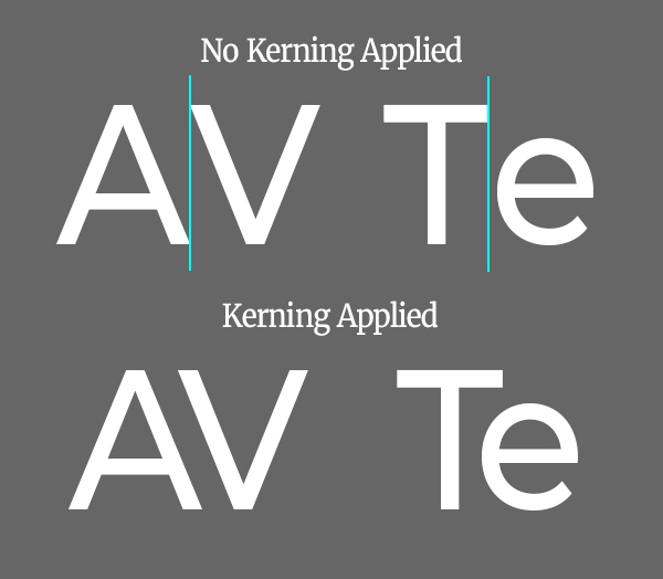
With kerning you can ensure that letters are spaced appropriately for optimal legibility.
Most typically, manual kerning is reserved for typography that is more artistic in nature such as logos, SVGs or images of typography. In these cases you may want to fine tune how some letters fit together. Test your kerning skills with this neat browser game.
Fortunately, font-kerning is available on the web to optimize text legibility in most modern browsers. By default, this CSS property is set to ‘auto,’ which allows browsers to decide whether kerning should be applied. The only catch is to ensure that your web font comes with kerning data and you’re good to go!
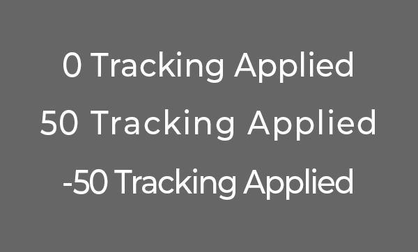
Tracking / Letter Spacing
The term ‘tracking’ refers to an equal distribution of space between letters. In contrast to kerning, which focuses on the adjustment of awkward letter pairs, tracking gives letters more or less breathing room across the entire body of text.
On the web, tracking is controlled with the CSS property, letter-spacing, and can come in handy for situations, such as acronyms where an all-caps word can seem a bit condensed.
Leading / Line-Height
In traditional graphic design, leading refers to the vertical space between baselines of multi-line text. Leading allows us to control the vertical rhythm of our content.
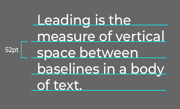
On the web, however, leading is measured in a slightly different way. The space between lines of text on the web is controlled by the CSS property, line-height. Line-height is the invisible bounding box around text that creates vertical space.
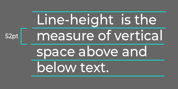
Since the actual height of letters is unpredictable, line-height allows us to set typography to match your grid system.
Setting Type in a Grid System
Setting type in a grid system can be tricky, but not impossible. Google Material Design suggests using a 4pt grid for typography.
The key to successfully aligning to a 4pt grid is choosing font sizes, line-heights that increment by 4pts.
For example, Google Material Design uses the following scale (font-size / line-height):
- Heading 1 - 6rem / 6rem
- Heading 2 - 3.75rem / 3.75rem
- Heading 3 - 3rem / 3.25rem
- Heading 4 - 2.25rem / 2.5rem
- Heading 5 - 1.5rem / 2rem
- Heading 6 - 1.25rem / 2rem
- Body Text - 1rem / 1.5rem
Note: 1rem is equivalent to 16px in this case.
This typography scale creates type that fits perfectly within a 4pt grid.
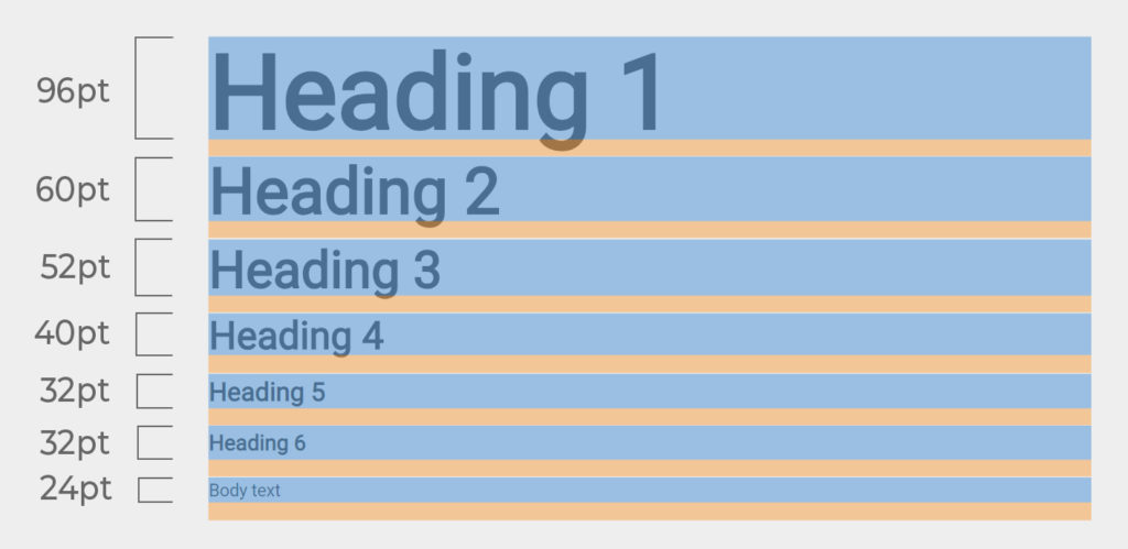
These font-size and line-height combinations create bounding boxes around the text with heights that are divisible by 4pts.
Down-Right Margin Method for Text
Much like other UI design elements, text can either appear stacked or inline with other elements as well. In this way, the Down-Right Margin Method can also be applied to text.
After setting your line-heights you may consider applying margin to further separate your text. Paragraphs and headings are stacked elements and can take a bottom margin. Spans and navigation links are typically inline and can take a right margin.
Conclusion
In conclusion, negative space is a big topic in UI Design. In this lesson we’ve covered why negative space is important, tips for using negative space effectively, the different types of negative space in UI Design, and suggested guidelines on how to approach negative space in your next project. Hopefully this lesson has brought you a greater understanding of negative space and how to use it effectively for your next project.
Next Lesson
Principles of Design: Repetition (Coming Soon)
Previous Lesson:
Principles of Design: Proportion
Principles of Design
- Lesson 1: Unity
- Lesson 2: Balance
- Lesson 3: Alignment
- Lesson 4: Hierarchy
- Lesson 5: Emphasis
- Lesson 6: Proportion
- Lesson 7: Negative Space «