Padding vs Margin: The Definitive Guide
2018-10-09Both padding and margin are very important in web design. They are the two ingredients of the CSS Box Model that create space on a web page. They may seem to have the same effect, but padding and margin serve two different purposes. If you’re unsure when to use padding vs margin, then you’re in luck! In this guide, we’ll cover everything you need to know.
TL;DR? Here’s a quick cheat sheet for reference:
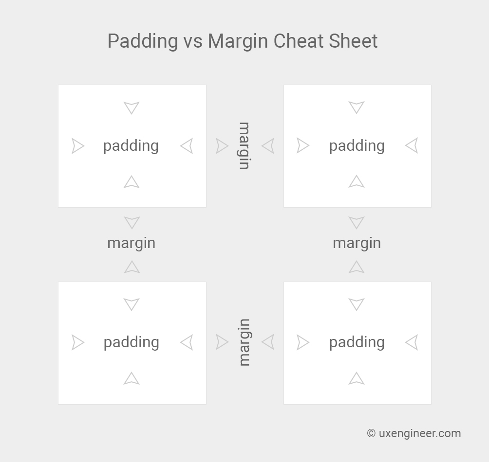
Essentially, you want to:
- Use padding for spacing within an element.
- Use margin for spacing between elements.
However, there is much more to it than that! Let’s get into the nuts and bolts of how this works, starting from the beginning: the CSS Box Model.
The CSS Box Model
When it comes to designing the layout of a web page, the CSS Box Model is arguably one of the most important concepts to understand. If you know what the CSS Box Model is and how it works, then you’ll better understand the how to use padding and margin the right way.
Why It’s Important
Every web page is composed of nothing but boxes. It’s true. Even if it doesn’t quite look like a box, it’s still a box. That includes circles, text, and triangles too.
To illustrate, here are a few things you might see on a web page that you wouldn’t consider to be very box-shaped.

However, from a web browser’s perspective, these same shapes look like this:
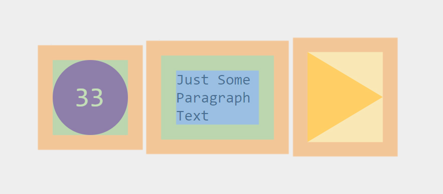
All elements in HTML have a top, bottom, left side, and right side. When you picture elements in this way, the CSS Box Model makes much more sense.
Parts of the CSS Box Model
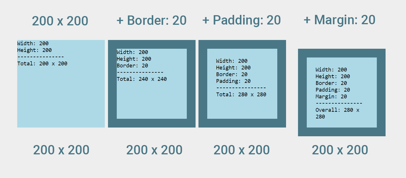
The CSS Box Model consists of 4 parts. Starting from the inside of the box and moving outward, we have the Content, Padding, Border, and Margin.
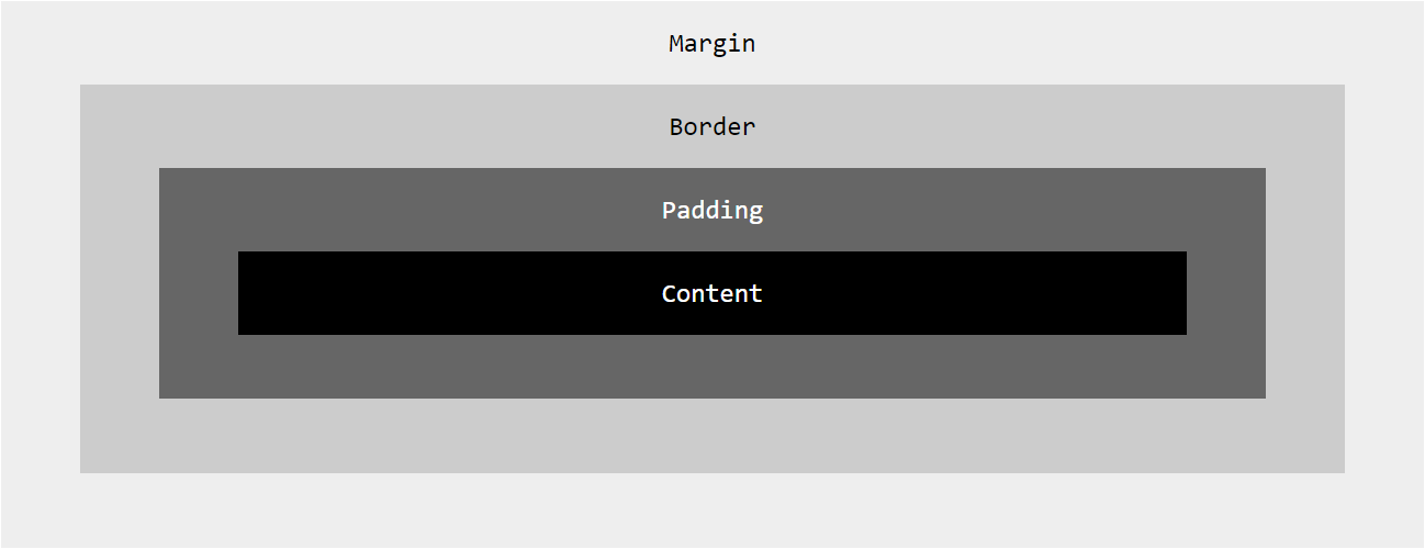
As illustrated above, padding and margin only represent half of the CSS box model. Unfortunately, they happen to be the “invisible” half, which is why it’s difficult to see (pun intended) what the difference is between them.
With this in mind, it’s easier to explain the difference between padding and margin if we include the two “visible” parts of the CSS Box Model: content and border.
Content, Border, Padding, and Margin
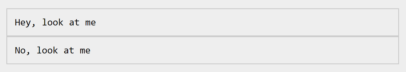
Below we have two paragraph tags. Our content can be found between the p and p. We’ve also specified a border to go around this content in the CSS.
<p>Hey, look at me!</p>
<p>No, look at me!</p>
p {
border: 1px solid #ccc;
}Result
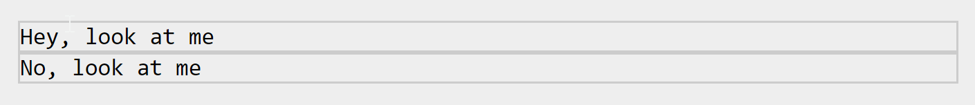
Great, now we can see what we’re working with here. How will margin and padding affect these two paragraph elements? Will they do the same thing?
Let’s start with padding and find out. We can give the content a little more “breathing room,” with padding.
p {
    padding: 10px;
}
Result
And we can add space “between” the two paragraph tags by adding some margin.
p {
    margin: 10px;
}
Result
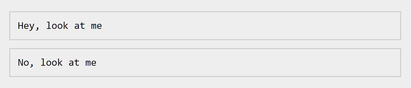
Now we’ve created space inside and outside of the border. With a border visible it’s easier to “see” the difference between padding and margin.
The Difference Between Padding and Margin
You might be thinking “So, if I don’t use a border, then it doesn’t matter whether I use padding or margin, right?” Actually, it still matters. There are still some differences between padding and margin that we need to discuss.
Let’s take a look at those differences.
Backgrounds with Padding vs Margin
In the previous section, I mentioned that margin and padding were the “invisible” parts of the CSS Box Model. However, that’s not entirely true. Background colors and images fill an element up to the border, which means padding is actually “visible” when a background has been applied.
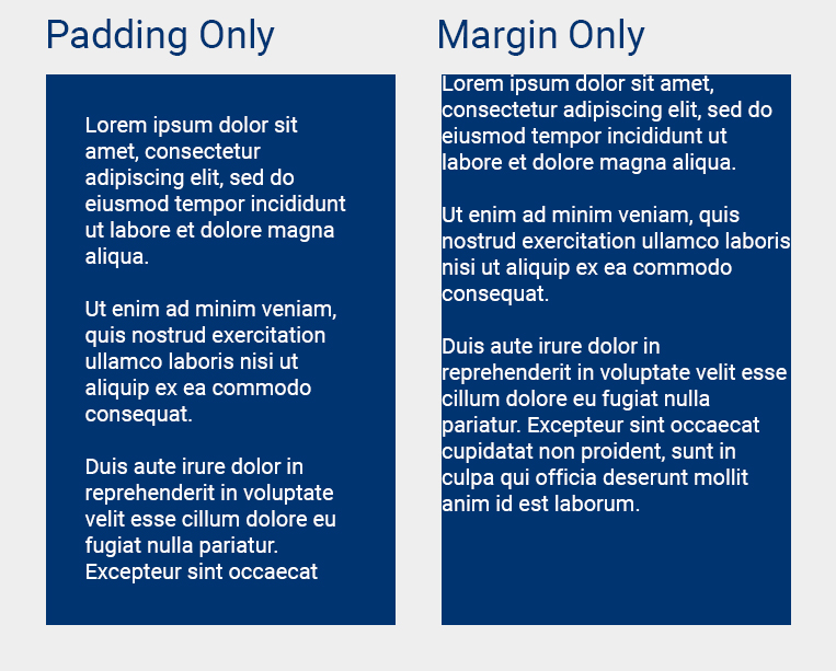
In the example above, we have two blue divs. The left div has padding applied and the right div has margin applied.
With a background color applied, it’s a little more obvious how these two properties differ.
Padding and Border Alter Dimensions. Margin Does Not.
One of the quirks of the CSS Box Model is how it affects the dimensions of an element. For example, when you specify a height and/or a width for a div, you are actually specifying the dimensions for the content only.
If padding and border are also applied, then the overall width of the element will be increased beyond what you’ve specified.
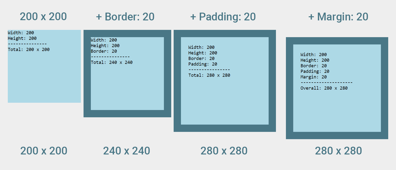
However, this rule does not apply for margin. As you can see in the example above, when margin is applied, space is only added to the outside (around) the sizable area.
This increase in dimensions is due to another property called box-sizing, which is set to “content-width” by default. With this default setting, you can experience alignment issues by changing dimensions, border, and/or padding. To avoid this, it’s recommended to set your box-sizing to border-box when using border and/or padding.
div {
   box-sizing: border-box;
}
This will include all border and padding in the original dimensions that you set.
What about the space between the first three divs?
Since margin is only applied to the last div, you may be wondering why there is space between the first three divs.
The short answer? This is due to the gap that we usually leave between the closing div tag and the next opening div tag. The line break between them in the code will create an actual gap that you can see on the page.
You can learn more about this in the previous post: How to Make Inline-Block Elements Add Up to 100% Width.
Margins Can be Negative. Padding Cannot.
Unlike padding, margins can hold a negative value. This allows us to do some interesting things when positioning elements.
Take, for example, a card-style container with a circle “badge” inside.
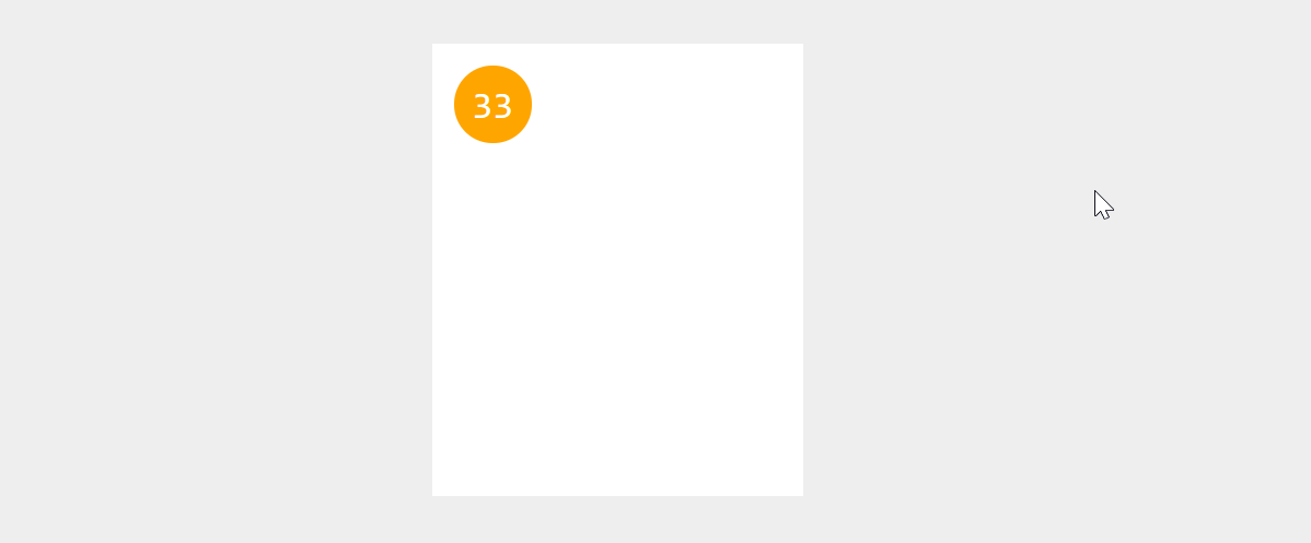
<div class="card">
    <div class="badge">33</div>
</div>
.card {
padding: 16px;
} Naturally, the padding of the card will add 16px of space between its own borders and the badge, pushing the badge inward.
However, if we want to position the badge just outside the top-left corner of the card, we can achieve this with negative margin.
.badge {
    margin: -20px 0 0 -20px;
}
Result

In the CSS, we’ve applied -20px of margin to the top and left side of the badge. Since we’re going the opposite direction this results in 4px overlapping the card (16px - 20px = -4px).
If you tried to do this with padding it would not work.
Margin Can Be Auto. Padding Cannot
Another cool facet of margins is that they can hold a value of auto. Auto is super handy when you need to center elements horizontally.
If you’re like me, you may have once tried (and failed) to center an element on a page by giving it a margin-left of 50%.
This is what that actually looks like compared to the auto value.
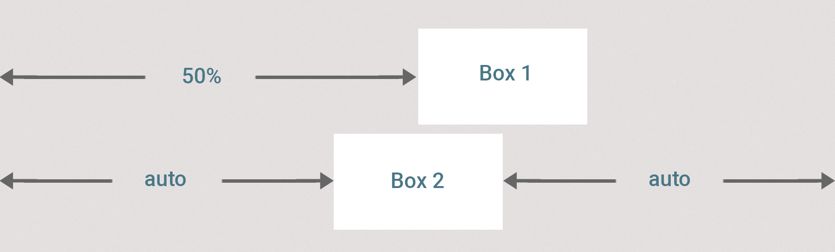
.box-1 {
   margin-left: 50%;
}

.box-2 {
   margin: 16px auto;
}
The auto value works by calculating the margin on the left and right sides needed to center an element. Unfortunately, this only works from side to side. You can not center an element vertically with auto.
Unlike margin, the padding property cannot take an auto value.
Margins Behave Differently With Inline Elements
Margins get a little weird when dealing with inline elements. In all the examples we’ve seen so far, we’ve dealt with inline-block and block elements. In those cases the margin has worked as expected. Let’s throw an inline element (a span) in the mix and see what happens.
I’ll call this the “spanburger / spandog” scenario.
<p>Top Bun</p>
<span>Delicious</span><span> Span </span></span>Meat</span>
<p>Bottom Bun</p>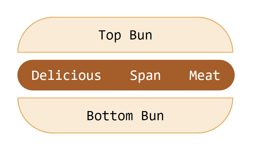
In the example above, we have:
- 16px of padding on the paragraphs (block elements)
- 16px of padding on the left and right of the spans (inline elements)
- 10px of padding on the top and bottom of the spans
- No margin has been applied yet.
p {
    padding: 16px;
}

span {
    padding: 10px 16px;
}
Even though there is no margin applied, our “Delicious Span Meat” appears to be levitating between the two buns. This is because the paragraphs have default margins on the top and bottom of 16px.
But that’s not the weird part.
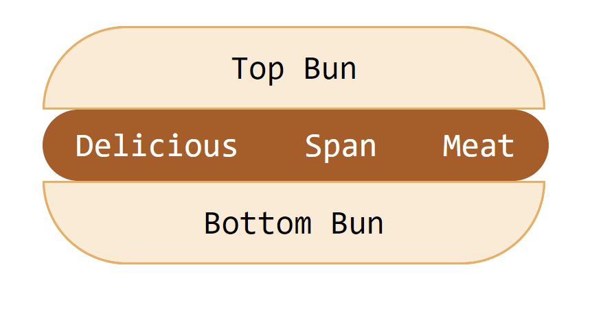
If we remove the default margin completely something unexpected happens.
p {
    margin: 0;
}
Result
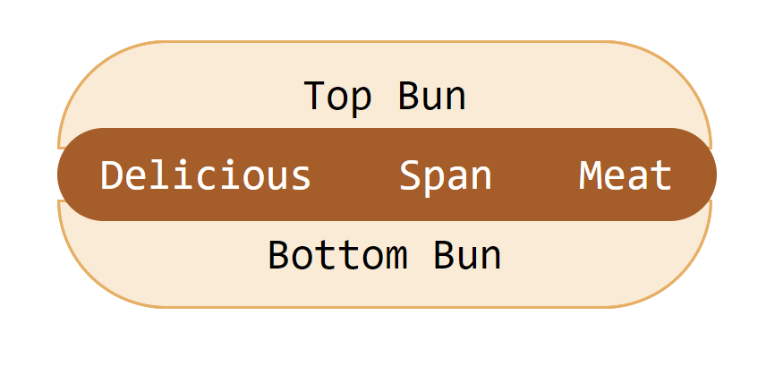
You would expected the buns to sit directly on top and below the meat, but instead it appears to sit behind it, resulting in a “spandog.”
If you look closely, you can see that the paragraphs are actually positioned on the top and bottom of the content within the spans, disregarding the borders. This is because inline elements (spans) flow with the content of the page.
If we set our spans to display: inline-block, our spanburger looks the way you would expect it to.
span {
    display: inline-block;
}
Result
Note in this example, the padding behaved as expected. However, top and bottom margins do not respect borders when they’re pushing against inline elements.
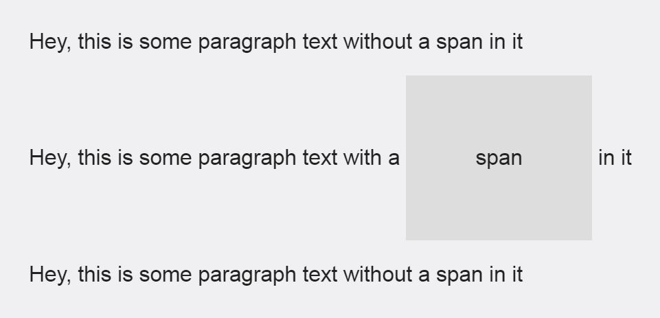
Padding Behaves Differently With Inline Elements Too
Top and bottom padding on inline elements gets ignored too…kinda.
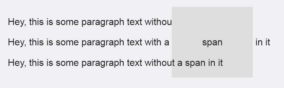
<p>Hey, this is some paragraph text without a span in it</p>
<p>Hey, this is some paragraph text with a <span>span</span> in it</p>
<p>Hey, this is some paragraph text without a span in it</p>
span {
background: #666;
padding: 45px;
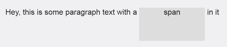
}This behavior is a bit bizarre. With inline-block or block elements, padding will respect the content around it and push away from it. As you can see in the example above, this does happen with the content on both sides of the span.
As previously demonstrated, this behavior happens the same way with top and bottom margins on inline elements. However, with padding it’s different because the top and bottom do not disappear, they are just simply ignored.
To make things weirder, the top padding disappears completely when you remove the first and third paragraph tags, but the bottom padding remains.
Like with most other inline element quirks, we can get the “expected” behavior by setting the span to display: inline-block.
span {
    display: inline-block;
}
Margin Collapsing
Margin collapsing is probably one of the most confusing aspects of CSS. It’s even considered to be one of the great design mistakes of CSS by some.
Understanding margin collapsing is not the hard part. The confusion around margin collapsing is mostly due to the seemingly never-ending exceptions to those rules.
Let’s look at an example:
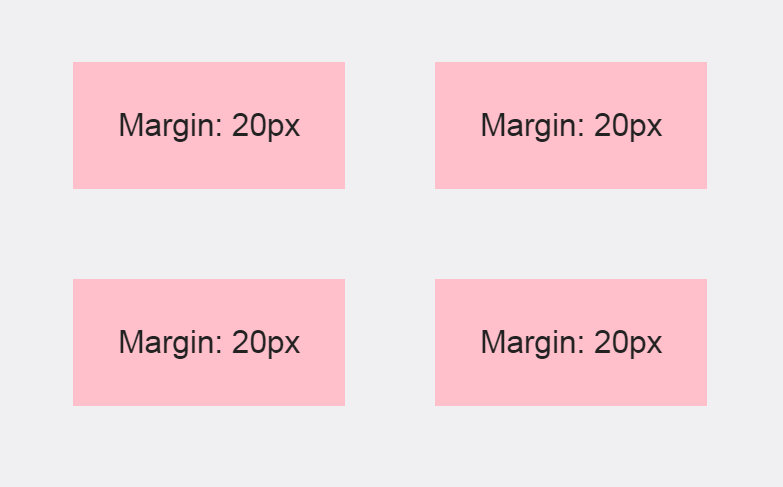
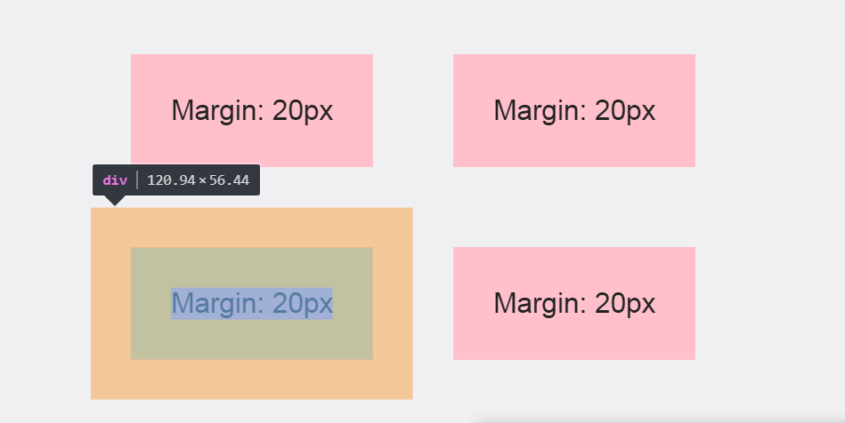
Each of these divs are set to display: inline-block and have a margin of 20px. Since margin is invisible it’s difficult to tell, but as you might expect, the margins for each div butt up against each other. This makes the actual margin between each div 40px.
For reference, here is what the margin looks like for one div in Chrome Developer tools.
You would probably expect the same behavior if each div was set to display: block, right? Well, let’s see.
div {
    display: block;
}
Result
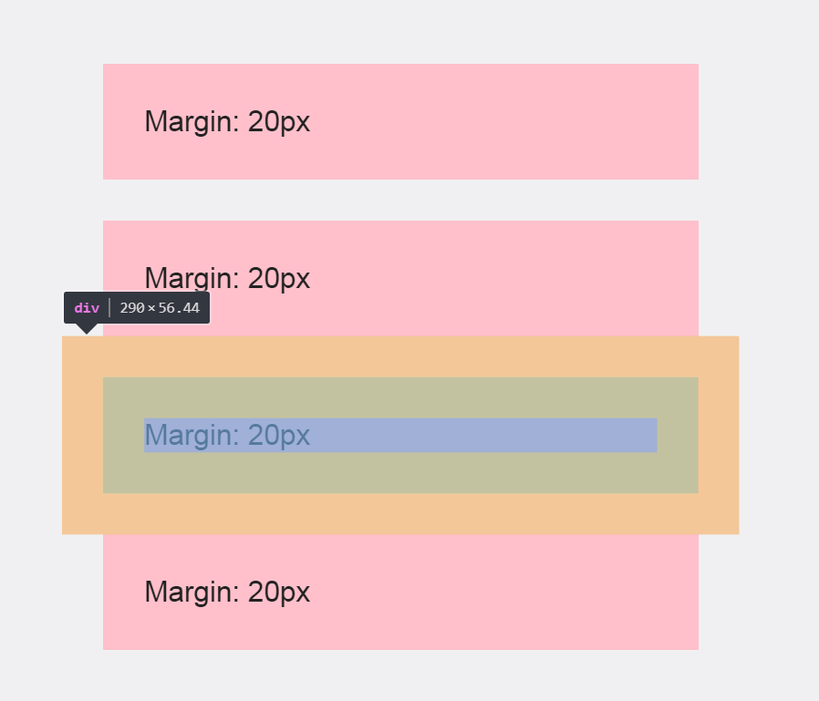
With each div set to display: block, the top and bottom margins collapse. To clarify, each div now has 20px of space between them instead of 40px.
The solution for this? In cases like these, I have found it helpful to rely on only one margin between elements. For example, if you want 40px between the elements at all times, you might try this instead:
div {
    margin: 0 40px 40px 0;
}
Without a top or left margin defined, they will never overlap (in this case). Therefore, you’ll have consistent spacing if your display settings are changed.
Conclusion
An effective use of white space is important to ensure focus, readability, hierarchy, and understanding. Without padding and margin, good UI design would not be possible. However, it’s important not to confuse the two. They were never meant to be used interchangeably.
Padding and margin have two distinct purposes. Padding is used for spacing within an element. Margin is used for spacing between elements. However, as we’ve seen, both certainly have their quirks about them. Understanding these differences, as well as the quirks that come along with them will help you understand when to use padding vs margin.


