Principles of Design: Hierarchy
2018-12-02Hierarchy is the thoughtful arrangement of elements to suggests an order of importance. In UI Design, hierarchy helps to influence the flow from the most important to least important element on the page.
Introduction to Hierarchy
Hierarchy provides the user with a road map to navigate throughout your design. In an era where attention spans and patience are limited, hierarchy can be the secret weapon that ensures your users find what they need, while encouraging them to explore further. Considering the importance of user experience, hierarchy is often critical to the success of an interface.
Hierarchy in design is a big topic. Many other design principles (alignment, emphasis, proportion, white space etc.) can help influence a hierarchical structure in your design. In this lesson, we’ll focus on a higher-level overview of how to create hierarchy in UI Design.
The Two Types of UIs
Generally speaking, user interfaces are either text-heavy or visually engaging. While some UIs strike a good balance between both, we often find ourselves on pages that are more of one than the other. Both types serve a different purpose.
- Interfaces that are text-heavy are generally intended to be more informative. Blog posts, news articles, and stories would fall under the “text-heavy” umbrella.
- Interfaces that are visually engaging are generally intended to be more exploratory. Online games, homepages, and landing pages would fall under the “exploratory” umbrella.
This distinction is important because either type can influence the way you’ll use hierarchy in your design.
Text-Heavy Content
The first UI type we’ll look at is text-heavy content.
Ever since we began using text as a form of communication, three important things have happened:
- We’ve been conditioned to read from left to right.
- We’ve been conditioned to read from top to bottom.
- We’ve been conditioned to “skim” content
…unless you are reading this in Arabic, Aramaic, Azeri, Dhivehi / Maldivian, Hebrew, Kurdish (Sorani), Persian / Farsi, Urdu, Hanuno’o, Batak, or Tagbanwa (source).
Understanding this behavior influences our use of hierarchy for text-heavy content. This is known as typographic hierarchy.
How Text Has Shaped User Expectations
The points mentioned above partially explains an observation known as the “F” pattern. Many researchers have conducted eye-tracking experiments to arrive at this conclusion:
People skim content first, then continue reading only if you’ve grabbed their attention.
This heat map illustrates the pattern that we follow when confronted by text.
The red to yellow areas represent where the most focus is given. In this example, we can see that people scan from the top and down first, along the left side of the text block. Attention is moved to the right areas that demand the most attention.
Given this behavior, we can see the importance of typographic hierarchy.
Typographic Hierarchy
People are not interested in reading every single word you have to say. Typographic hierarchy allows you to organize your content in a way that helps readers find the information that is most pertinent to their needs.
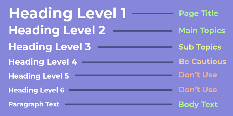
In its most basic form, typographic hierarchy is created with headings, followed by body text. If you’re familiar with HTML, you’ll know that there are six levels of headings that can be applied to content.
From an SEO perspective, it may be worthwhile to take advantage of all six heading levels. However, from a design perspective, more than 3 - 4 levels of hierarchy becomes very difficult to follow.
As a general rule of thumb, when creating text-heavy content, headings and body text should be used in this manner:
Heading Level 1
Your most dominant heading (heading level 1) should be reserved for the title of the page. Just as every book only has one front cover, a page or interface should only have one main heading.
Heading Level 2
The second most dominant heading (heading level 2) should be used as markers to break up your content into logical sections. These headings assist readers in finding the content they want to engage in, so make them relevant, inviting, and captivating.
Heading Level 3
The third most dominant heading can be used to further explain a more dominant heading or break up larger sections into smaller ones between your level 2 headings.
Body Text
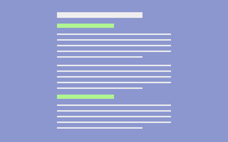
Body text is used between the headings. To avoid monotony and keep content digestible, it helps to break up the layout of your content with the use of bullet points, bold text, italics and images.
All combined, this creates typographic hierarchy, helping the reader move through the content in priority order.
A Few More Things to Consider
The purpose for typographic hierarchy is to help readers engage with your content. A good use of headings will work well in this case. However, there are other factors to consider:
- Use center-align and right-align with caution. As mentioned in the Alignment Lesson, readability declines when more than 4 - 5 lines of text are centered and 1 - 2 are right-aligned.
- White space helps establish hierarchy. Use less white space between headings and body text to establish a relationship between the two. Separate new sections with more white space to create more distinction.
- Keep your content between 50 - 75 words per line. Research has shown that shorter lines of text are easier to read than longer lines.
That takes care of text-heavy content. Now, we’ll see how hierarchy with visually engaging content differs.
Visually Engaging Content
The next UI type we’ll look at is visually engaging content.
Unlike text-heavy content, visually engaging content makes use of more images, colors, and features to communicate an idea. As a result, the eye does not necessarily follow the same “F” shaped pattern that it does with text-heavy content.
Instead, our tendency to move from left to right and top to bottom can be disrupted by contrast. The elements with the most contrast win our attention.
Visual Hierarchy by Composition
Composition is used to describe a work in it’s entirety. In art it describes a painting. In music it describes a song. In UI design, it describes an interface.
Unlike paintings and songs, interfaces come with different constraints:
- Because they’re accessed by different devices, UIs are viewed at variable widths and heights
- Elements above the fold will naturally be seen more than elements below the fold
- The basic structure of HTML (Heading, Body, Footer) which has defined user expectations from the beginning
Altogether, these constraints have a major impact on how to create hierarchy. As a result, certain UI patterns have evolved over time to assist us in design. The type of UI pattern you choose (or create) will largely depend on the number and importance of actions the user can take.
Primary and Secondary Actions
The phrase “above the fold” describes the area that visitors are guaranteed to see. In UI design, this area is considered to be prime real estate because 57% of your user’s time spent is spent there, according to Norman Neilson Group.
While visually engaging content comes in many different forms above the fold, one of the most widely adopted UI patterns used to establish hierarchy is the use of the hero section.
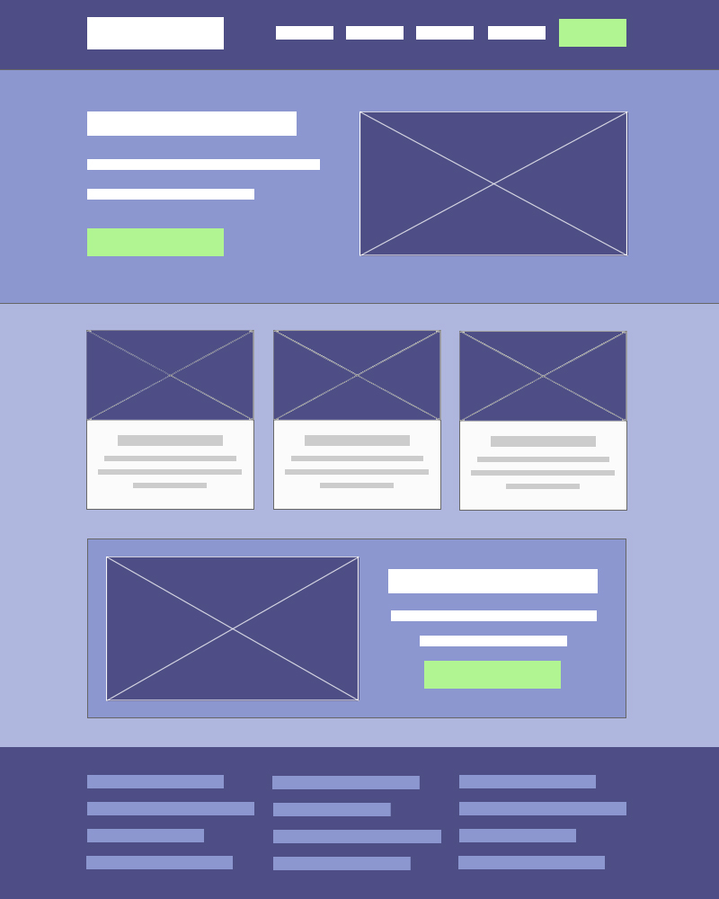
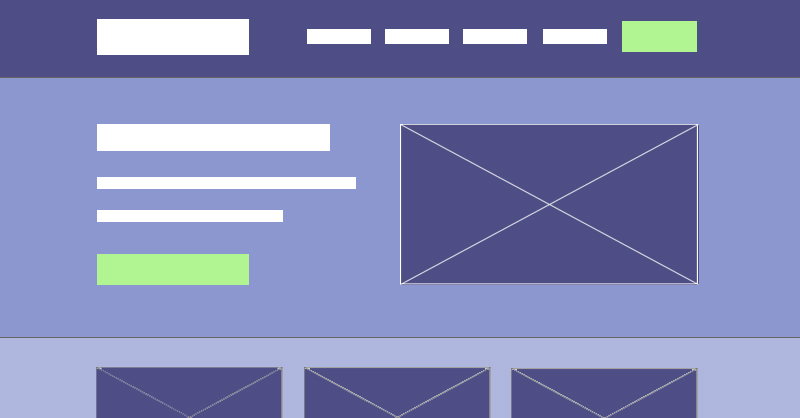
This UI pattern is useful when you have a single action whose importance is disproportionate to others available. Above the fold (on desktop devices), the layout for this UI pattern typically looks like this:
Rather than looking at the hierarchy of individual elements, we’ll first focus on the hierarchy of the layout itself. It’s composed of three horizontal sections:
- The hero section
- The main navigation
- Additional content
Note that the order above is not in the same order the sections appear in the image from top to bottom. That’s intentional. The hierarchy for each of these sections is determined by the visual contrast of each section, rather than the order they appear. Let’s look at each section individually:
The Hero Section
The hero section is meant to be the biggest and most visually striking section above the fold. It’s often comprised of an image, a header, body text, a primary button, and sometimes a secondary button.
The large image is meant to help draw your eye to the hero section first, which then wanders to the text associated with it, known as the call-to-action. In the example below, Zendesk uses hierarchy within this section to guide attention to the primary action (View Demo).
Given that the goal of many websites is to make money, the hero section is typically used to highlight the main product or service the company offers and send them down a path that will encourage a sale.
The Main Navigation Section
A short sales pitch in the hero section does not guarantee your user will click your call-to-action button. In fact, most will continue to explore your page. After the hero section, the next place users typically look at is your navigation. This section typically includes a logo and links to the main pages of your website.
It’s important to point out that this section is only the next in hierarchy if it has more dominance than the additional content below the hero section. For this reason, you’ll often see another call-to-action button, giving it more visual weight to draw attention.
Additional Content
This section constitutes anything below the hero section. The type of content in this section is often more ambiguous. However, it typically serves the purpose of building trust with your visitor. For this reason you’ll often find logos of other associated brands, the companies values, or testimonials.
One of the key purposes of this section, from a behavioral aspect, is to indicate that there is more content to explore. By leaving enough additional content to peak above the fold, you can encourage users to continue scrolling.
Many Equal Actions
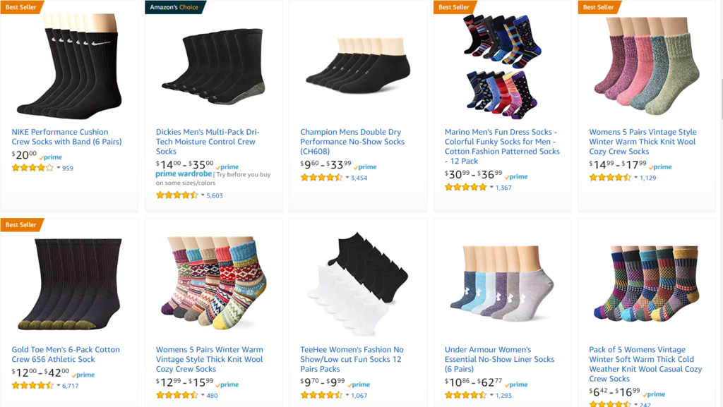
The hero section is a good UI pattern for interfaces with primary or secondary call-to-actions, but what about interfaces that have multiple, but equal actions the user can take? In cases like these you can demonstrate equal importance with repetition.
Product finding pages, such as this one from Amazon, are a great example.
In cases like this, the hierarchy is less about the composition and more about the individual components. In the example above, there is enough consistency to establish the equality of each option. However, “best seller” and “Amazon choice” tags are used to draw more attention to certain items.
A Few More Things to Consider:
If everything stands out, nothing stands out. Establishing hierarchy for visually engaging content boils down to the distinction between elements in your design and the overall composition. This distinction is known as contrast, which can be achieved in the following ways:
- Increasing the size of elements compared to others
- Choosing colors that stand out next to others
- Positioning elements to break the alignment with others
- Breaking repetition by giving elements a distinct characteristic.
We’ll explore these strategies in greater detail in the “Contrast” lesson at the end of this course.
Conclusion
A deliberate use of contrast in your design can be used to create hierarchy and demonstrate a clear order of priority. Depending on whether your UI is text-heavy or visually engaging, you’ll have things to consider in your approach. Overall, hierarchy not only helps the user find the most pertinent information, but can also be used to guide users in the direction you prefer.
Next Lesson
Principles of Design: Emphasis
Previous Lesson
Principles of Design: Alignment
