Principles of Design: Emphasis
2018-12-21Emphasis is used to indicate importance or dominance. Elements in your design can be emphasized by taking advantage of other design principles, including proportion, white space, movement, and contrast.
Introduction to Emphasis
Emphasis is a powerful way to control how a user will experience your design by making elements stand out when necessary. In this lesson, we’ll discuss how Emphasis is used to create the focus and establish hierarchy within your design.
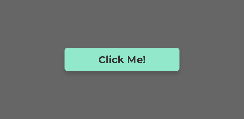
Let’s start with an example of emphasis in UI Design.
Emphasis in UI Design
The fewer elements you have on a page, the easier it is to understand what you intended to communicate.
However, as more elements are added to your design, it becomes difficult for the eye to distinguish what it should focus on first, effectively losing any sense of hierarchy.
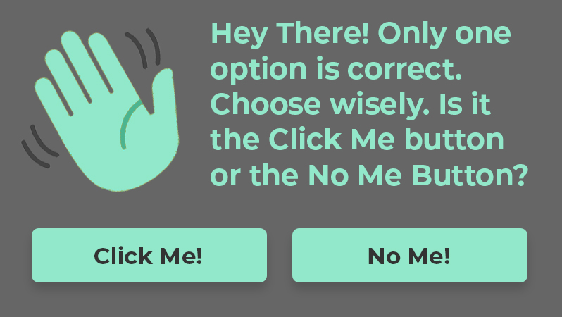
In the example above, each element has roughly the same amount of emphasis. As a result, it’s not immediately obvious what your supposed to look at or what you’re supposed to do. It takes the brain longer to process the design and understand it, resulting in a poor user experience.
UI Design requires us to add and take away elements until the design is complete. Therefore, it’s necessary to reevaluate whether each elements has the right amount of emphasis to create proper hierarchy.
Assessing the Hierarchy
Continuing with the same example, let’s assess where emphasis could be applied or reduced to improve the design.
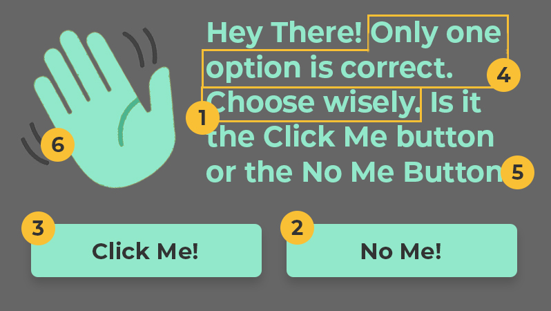
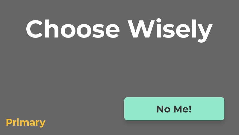
In this example, we’ve identified the most important to least important elements and ordered them accordingly.
- The call-to-action will be to “Choose Wisely,” making it immediately clear what the user should do.
- The primary button will be the “No Me” button. We’ll make this the second most emphasized element, so the user can can have confidence that it’s the “right choice.”
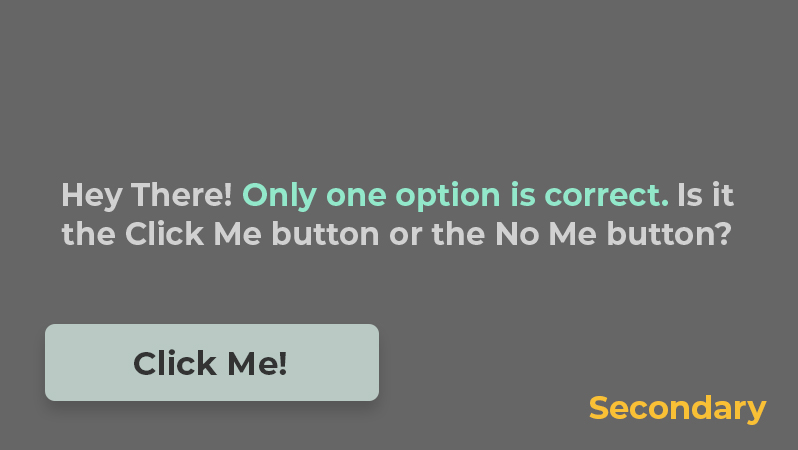
- The secondary button will be the “Click Me” button. This button will have less emphasize to make it clear that it’s not as important as the primary button.
- Next, we’ll make sure the reader knows “only one option is correct” by giving it more emphasis than the remaining text.
- The remaining text is merely provided for more context. Since it’s not as important as the previous elements it will be toned down a bit.
- Finally, the waving hand icon is the least important element. If anything, it only serves to help communicate the message subconsciously. Therefore, it will be muted to fade into the background.
Ideally, this is the order we would like our user to see each element of the design. With this plan in place, we can now strategically add or reduce focus for each element until we’ve created visual hierarchy:
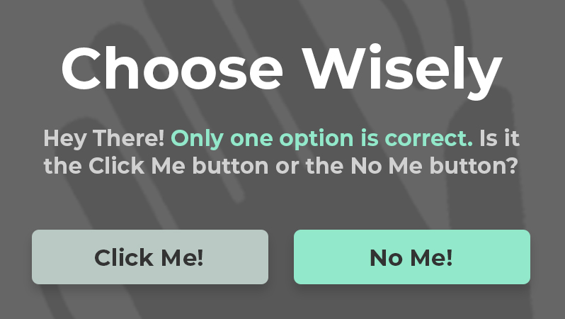
Take note of where your eye is first drawn to and how it moves around to each element of the design.
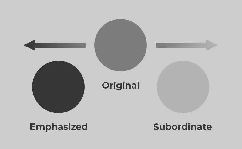
Emphasis vs Subordination
Both emphasis and subordination were used to establish hierarchy in this example.
- Emphasis is used to make elements stand out and become the focus of the design.
- Subordination is used to mute or tone down elements, pulling them out of focus.
Adding more emphasis to an element helps it stand out, however, you can achieve the same result by muting the elements around it.
To use this strategy effectively, it’s helpful to think of your elements in terms of primary, secondary, and tertiary information.
Primary Information
The elements that your user needs to see should be classified as primary information. These elements should have the most emphasis.
Secondary Information
The elements that you want your users to see (but aren’t required to) should be classified as secondary information. They should not stand out more than the primary information.
Tertiary Information
The elements with the least importance should be classified as tertiary information. These elements should be subordinate to other elements in your design.

How to Create Emphasis or Subordination
After you’ve considered what should stand out and what should be muted, you can use the any of the following methods to create emphasis or subordination:
Proportion describes the size of an element, compared to those around it. Larger elements will have more emphasis and smaller elements will appear subordinate.
White Space describes the distance between elements to create grouping or isolation. Elements that are grouped can appear subordinate to elements that stand in isolation.
Movement describes the use of elements to insinuate direction. This can be use to “move” your user to the focal point.
Contrast describes the distinction between one element and those around it by means of color, size, shape, or alignment.
Each of these methods can be used individually or combined to create emphasis and/or subordination in your design. We’ll cover each of these in more depth in the upcoming lessons.
Conclusion
Emphasis is a powerful design principle that helps to establish focus and create a sense of hierarchy. Subordination is the opposite of emphasis, but can also be used to make other elements stand out. In the next lesson, we’ll see how proportion can be used to create emphasis, as well as indicate the relationships between elements.
Next Lesson
Principles of Design: Proportion
Previous Lesson
Principles of Design: Hierarchy