Principles of Design: Alignment
2018-11-20Alignment is the principle of design used to create structure, organization, and improve readability. The effects of alignment are often subtle, but it can be the difference between a polished and unpolished design.
Introduction to Alignment
Alignment can be easy to overlook because its often invisible. In the first lesson of this course, we discussed how unity was the end goal of UI Design. Alignment helps us to create a sense of unity by providing structure and connecting elements in a subtle, yet powerful way.
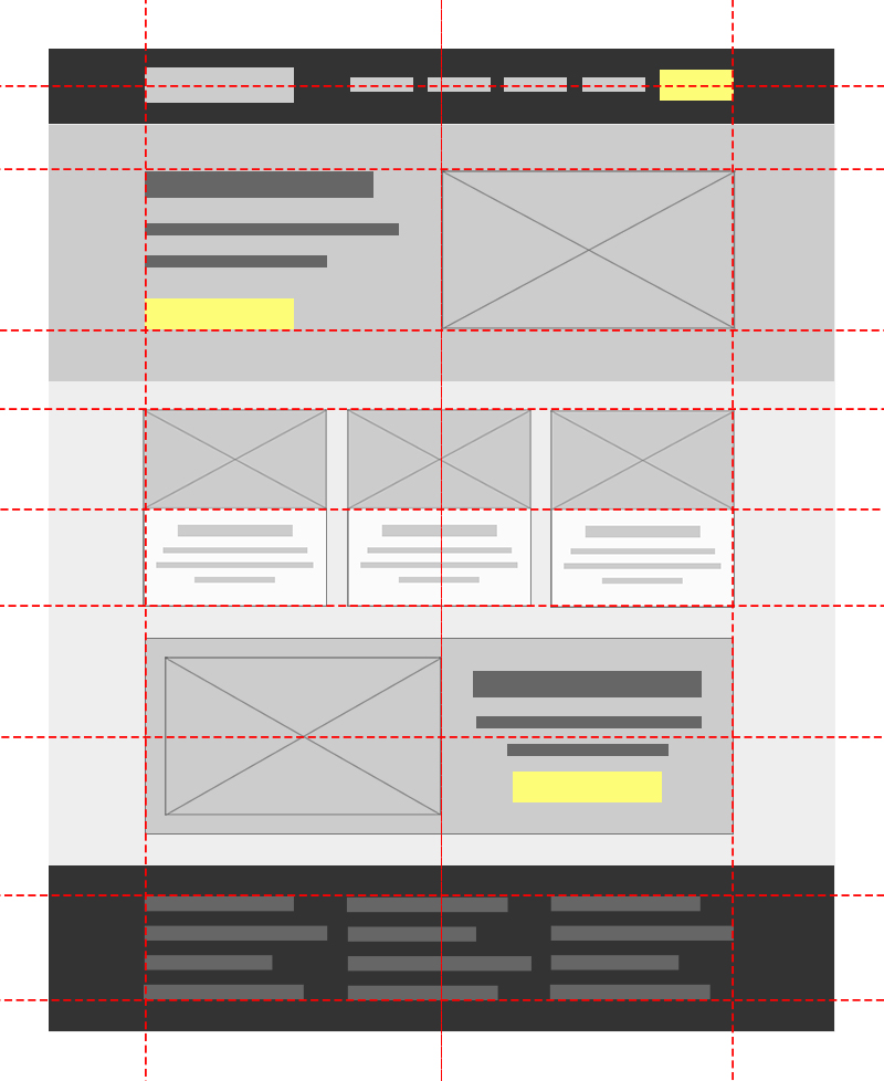
In this lesson we’ll cover the different types of alignment and how to use them in UI Design.
Vertical and Horizontal Alignment
It’s easy to confuse horizontal alignment and vertical alignment because they are both defined the opposite way you might think.
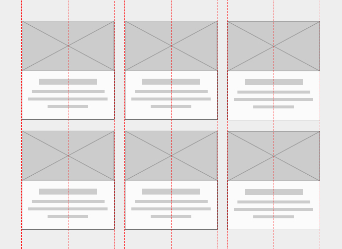
Vertical Alignment
When the center, top, and/or bottom of elements align on an invisible horizontal line, you create vertical alignment.
Vertical alignment gets it name, not because of the invisible horizontal lines, but because of the vertical space within the element being aligned with another. One trick to remember this is to think of the direction you go when drawing a line from top to bottom.
It’s not always necessary or possible for a row of elements to be vertically aligned by their tops, bottoms AND center. In many cases, your elements will have variable heights and you’ll have to decide which of these makes the most sense.
Top or Bottom Vertical Alignment
When the heights of two or more elements are drastically different, it might make sense to vertically align them by their tops or bottoms.
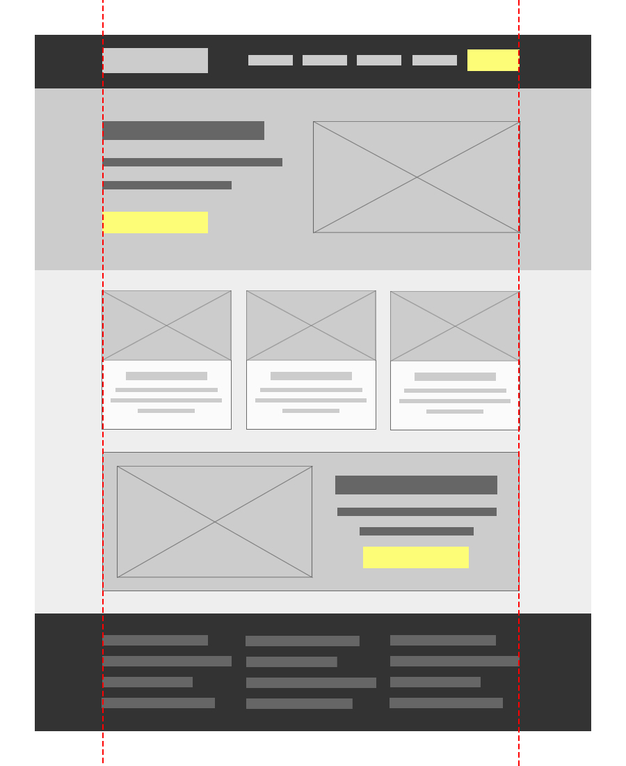
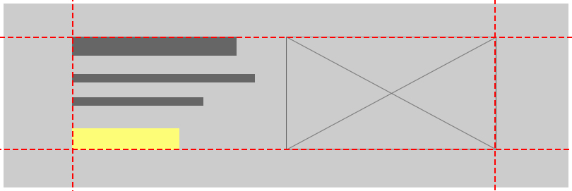
In this example we have a top vertical alignment on the main body section and the sidebar.
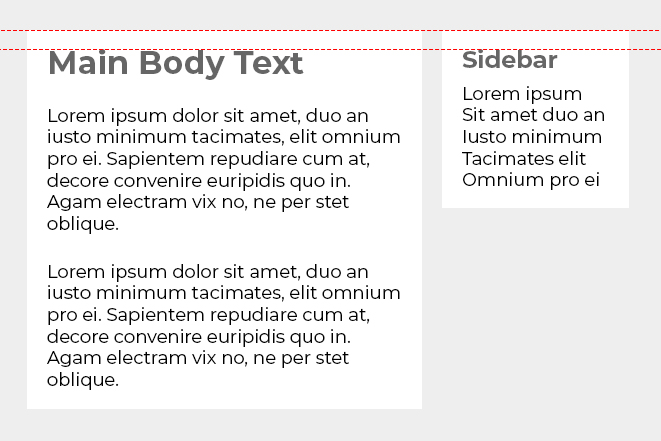
In the example above, notice how both containers and their headings are aligned to establish a connection between both elements.
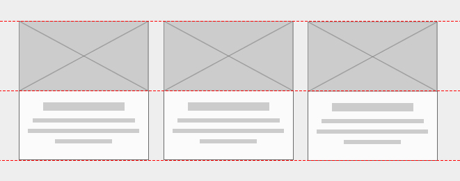
Centered Vertical Alignment
In cases where an element’s height may vary, but not drastically, it might make more sense to vertically align them across the center.
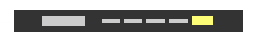
In the example above, we have a centered vertical alignment for each of the navigation elements in the header.
Horizontal Alignment
When the center, left side, and/or right side of elements align on an invisible vertical line, you create horizontal alignment.
You can remember horizontal alignment by thinking about the direction you go when drawing a line from left to right.
As with vertical alignment, you do not necessarily need to align the left, right, AND center of elements to have horizontal alignment. There are many cases where just one of these is sufficient.
Left and Right Horizontal Alignment
When designing a layout, the easiest way to ensure left and right alignment is to establish a max-width for all of your content in the very beginning. This invisible box will ensure your elements are aligned whether they are pushed to the left or right side.
Centered Horizontal Alignment
Centered horizontal alignment can be useful when you have a single element in a row. The most common use case for this in UI design is with call to action text.
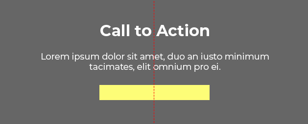
In the majority of cases, however, text should be aligned to the left (if your audience reads from left to right). Left alignment helps the eye jump from one line to the next in a predictable way. Readability begins to decrease with centered or right alignment after a few lines of text, so it’s good to be mindful of this when designing.
Media Object Alignment
Media objects are a very common UI pattern, but with variable width icons, it’s easy to end up with misalignment. One tip for media object alignment is to center align your icons and left align all of your text, like in the example below.
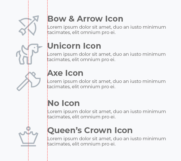
Notice that in this particular case we are aligning like items with like items. Although the fourth element has no icon, it remains left aligned with the text above.
Edge Alignment
Edge alignment occurs when we create vertical and horizontal alignment from one or more corners.
By anchoring elements in each corner it’s easier to guide the eye from one element to the next.
Optical Alignment
In some cases, top, bottom, left, right and center alignment is not the answer. You’ll often run into cases where elements are aligned perfectly, but do not appear to be due to the uneven distribution of visual weight of an element.
In these cases you’ll have to use your eye and adjust the alignment according to what looks best.
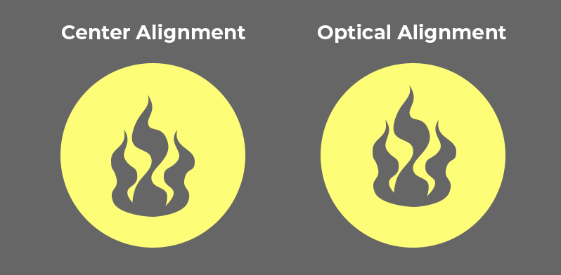
In the example above, the left icon is centered vertically and horizontally within the circle. However, the bottom of the icon is visually heavier than the top. The right icon has been optically aligned within the circle to appear more balanced.
Conclusion
Alignment makes a design look clean and polished. It helps to give your design organization and structure. There are several types of alignment, and some are more appropriate to use than others, depending on the circumstances.
Next Lesson
Principles of Design: Hierarchy
Previous Lesson
Principles of Design: Balance