Principles of Design: Unity
2018-11-04Unity is a measure of how well each element of your design works together. It describes the overall design, and whether it’s components work together in harmony to communicate a single idea. Unity is the most important Principle of Design because it brings your design together as one cohesive unit.
Introduction to Unity
Each of the design principles in this course relate to “parts” of your overall design. Unity refers to the sum of those parts.
Unity is the end goal of UI design, but that doesn’t mean you should save it for the last thing to consider. In order to achieve a sense of unity with your design, you’ll need to plan ahead and decide the overall message you want to communicate. By beginning this course with unity, we will approach design from a big picture perspective, ensuring that unity remains the focus at all times.
Thinking Like a Designer
Unity can be difficult to master because we often jump straight into designing the details without first considering how those details fit into the big picture. If you fail to look at the big picture first, it’s likely that all of your hard work and effort will result in a poor design.
To illustrate, we’ll start with a simple scenario that is often overlooked: Grocery Shopping.
The Grocery List Example
Creating a list for groceries is a simple task - You find the recipes you want to make for the week, then write down all the ingredients you need to buy.
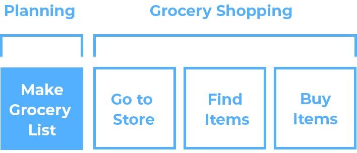
This is the the first step in your overall “grocery shopping experience.” For many, this step is somewhat removed from the steps that follow. As a result, we end up with grocery lists that look something like this:
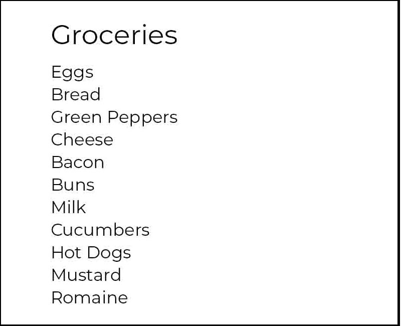
At first glance, you might think there is nothing wrong with this list. It serves its purpose in communicating the ingredients you need to buy. However, let’s take a look at it from a design perspective and spot the issue.
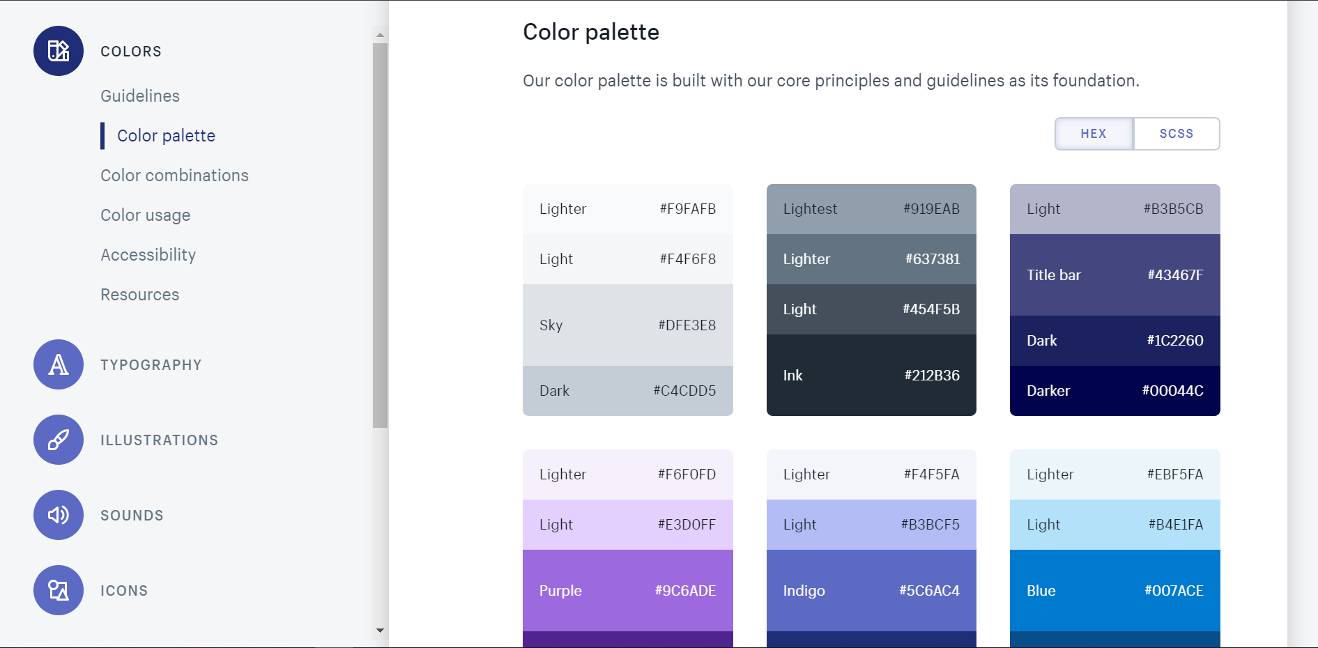
The Principles of Design
This simple list appears to have all the right parts to effectively communicate which groceries you need to pick up from the store. We can even see how all of the Principles of Design are demonstrated in this one simple example.
- Balance - Visual weight distributed evenly down the page.
- Alignment - A list format that’s easy to scan.
- Hierarchy - A heading with list items below.
- Emphasis - Larger font size on the heading.
- Proportion - Smaller font side on the list items.
- White Space - Space around and between the text.
- Repetition - The size and color of each list item.
- Movement - The eye moves top to bottom as intended.
- Contrast - Dark text on the white background.
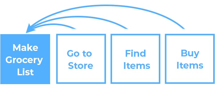
But what about Unity?
One could argue that the design of this list is unified because it demonstrates all of the other Principles of Design. Each list item shares a common thread: they are all groceries.
However, if we examine the relationships between each of these list items, we might stop and ask “what do cucumbers and milk have in common?”
A Closer Look
Unity is a measure of how well each element of your design works together. This would suggest that a design can be very unified, somewhat unified, or not unified at all. Our grocery list example above is somewhat unified. It gets the job done, but it’s still not the most effective design.
Despite having all of the Principles in Design demonstrated in our grocery list, the end result is a poor design because we didn’t consider the big picture first.
The Big Picture
Before we head out to buy our groceries, we might stop and ask ourselves a few questions:
- What role does this grocery list play in my overall shopping experience?
- What kind of shopping experience would I like to have?
- How can I better communicate this information to myself?
By thinking in these broader terms, we’re able to achieve unity from the very beginning. You’re no longer designing a simple grocery list, you’re using design to improve your entire shopping experience.
From the big picture perspective, you can consider the store’s layout, which isles you’ll need to visit, and the order those isles appear. With this new information, you can redesign your grocery list to look something like this:
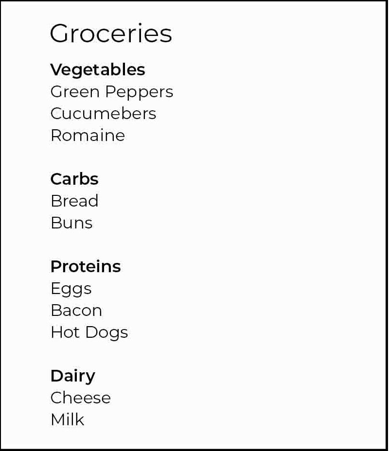
The result is a greater sense of unity and an improved shopping experience. By taking a little bit more of time and effort to “design” your grocery list in this way, you save much more time an effort in the end as you get in and out of the grocery store more efficiently.
Big picture thinking is where good design begins.
Unity in UI Design
In the previous example we looked at the trivial task of creating a grocery list from a big picture perspective. This same approach should be taken with UI Design.
If you are designing a brand new product from scratch, the type of questions you’ll want to ask yourself, include:
- What problem does my product solve?
- Who am I solving this product for?
- What’s the overall message that will resonate with this audience?
- How can I break my overall product down into smaller pieces and organize them?
It’s important to answer these types of questions before you begin designing. The more information you can gather, the easier it is to organize and achieve a sense of unity in the end.
Create a Brand Style Guide
Your brand includes design elements that should be carried throughout your product consistently. These elements include the name of your product, logo, color scheme, and font styles. Branding can also include subtleties, such as hover effects, the tone of voice in your copy, and phrases that are repeated often.
One of the most effective ways to ensure you achieve unity with your design is to create a brand style guide, such as this one from Shopify.
Brand style guides act as a go-to resource to encourage a consistent look and feel throughout your entire product. They can cover everything from colors that you can or cannot use together to how sound should be implemented across your website.
Unity in Communication
What’s the overall message that you want to resonate with your audience? There are three important things that this message should do:
- Communicate who you are
- Communicate what problem you can solve
- Communicate who you can solve this problem for
Optimizely does this very effectively on their homepage. Their overall message is:
“Out-experiment. Outperform. Optimizely is the world’s leading experimentation platform, empowering marketing and product teams to test, learn and deploy winning digital experiences, everytime.”

In the same way that chapters carry a theme throughout an entire book, to establish unity in your communication, everything should revolve around this central message. Each additional section of Optimizely’s homepage contributes to this overall message.

And further down…

And once again…

All additional communication throughout the design of their homepage helps to reinforce the overall message, promoting a sense of unity.
Thinking Beyond Your Product
Big picture thinking doesn’t stop at your product. Your users will arrive with certain expectations already in place. How might you ensure that your product aligns with those expectations?
Web standards, conventions, and best practices allow you to not only achieve unity within your design, but also promote unity outside of it. Your product is one of many that your user will experience throughout their day. You can meet their expectations upon arrival by taking a few extra things into consideration when designing.
Benchmarking is a great way to understand what type of design expectations your users might have. You can do this by comparing websites that your users visit and watching for design patterns to emerge.
For example if you’re designing for an online store that specializes in bedding, you might consider what the bedding shopping experience is like on competing products before you begin.
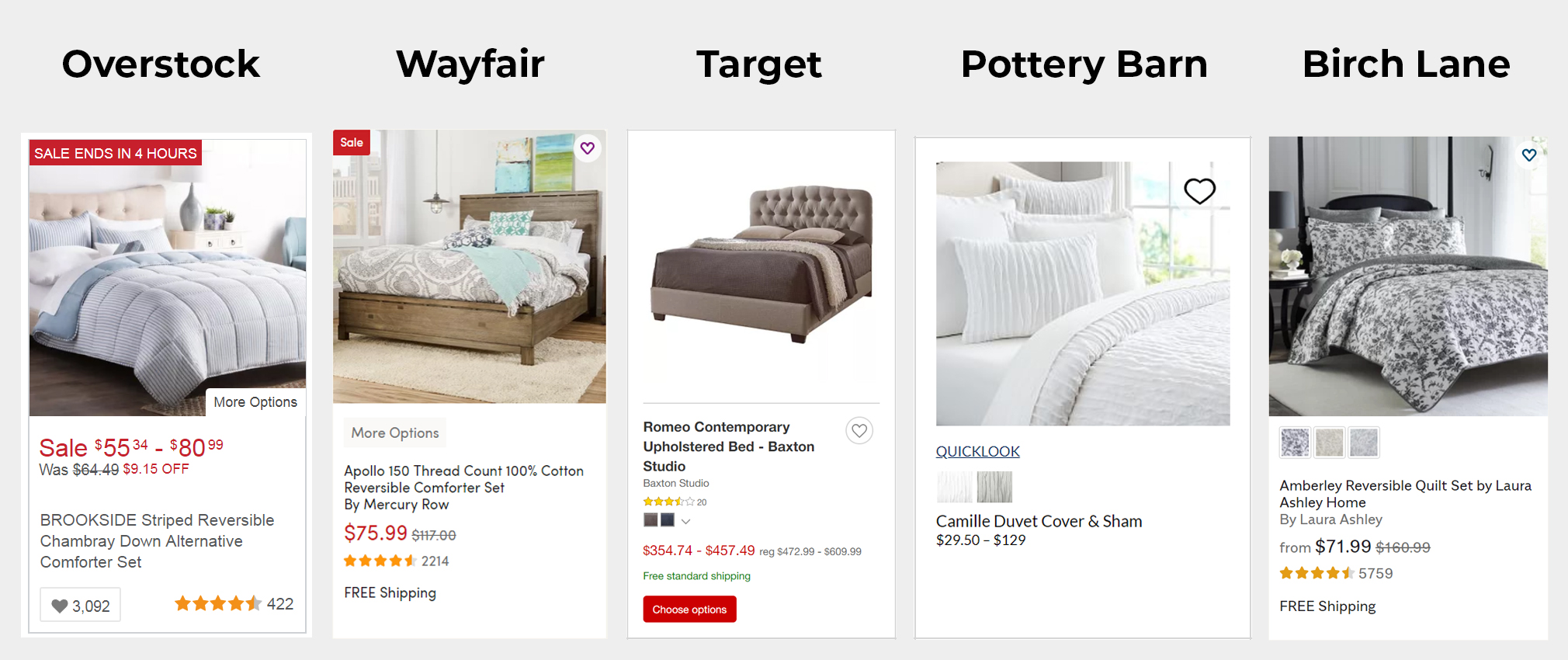
In the example above, we have product listings from 5 major retailers that sell bedding. There are a few some interesting observations we can make:
- Product images are always above the product details.
- Heart icons are always used to add products to your wish list.
- Product information always includes the product title, rating, and price.
- Color or pattern options are often available on the product listing.
- Free shipping is often stated with the product information.
- A ‘More Options’ button is often used with the product information.
With these types of observations, you can begin anticipating your user’s expectations and design around them. By thinking about how your product fits within the big picture of the internet, you can begin working toward a sense of unity on a global scale.
Conclusion
Unity is the end goal of UI design. To establish a sense of unity throughout your design you’ll need to “think big” before you even begin designing elements on the page. Answer the big questions before jumping into the details. The exercises in this lesson will help you start thinking about how to achieve a sense from the very start.
In the following lessons, we’ll see how other Principles of Design work together to help establish sense of unity within your design.
Next Lesson
Principles of Design: Balance