Principles of Design: Proportion
2019-01-10Proportion is the harmonious relationship between two or more parts that make up a whole. Most typically, proportion is defined by the scale of elements, in relation to each other.
Introduction to Proportion
Proportion has a long history of defining beauty in art and design. Ancient Egyptians used a grid system for their wall art, helping to establish scale, proportion, and illustrate hierarchy. The Ancient Greeks were fascinated with the proportions of the human body. The Golden Ratio was used to create “perfect” proportions for the Gutenberg Bible. There is no shortage of examples of proportion being carefully considered.
Today, proportion lives on as a powerful design principle that helps form consistency, hierarchy, rhythm, and overall beauty in design. In this lesson, we’ll discuss how to use Proportion in UI Design.
Size vs Scale vs Proportion
In order to take advantage of proportion in UI design, we must first understand the differences between size, scale, and proportion. All three of these terms are related, but there are some clear distinctions to consider.
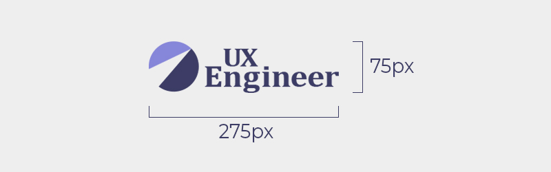
Size is the actual dimensions of an element, often measured in px, pt, em, rem etc.
For example, the size of this logo is 75px tall and 275px wide.
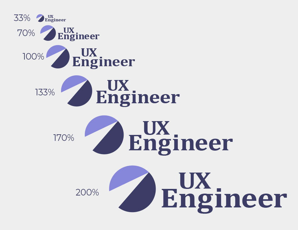
Scale is the relative dimensions of an element, often measured by percentages or multiples.
For example, an element can be scaled to be bigger or smaller than it’s original size.
Proportion is the harmonious relationship between two or more elements of scale.
For example, if one element increases in size, the remaining elements should also increase at the same rate to remain proportionate.
Proportion in UI Design
Comparing a proportionate and disproportionate logo is one thing, but you’re probably wondering “How does this work for UI Design?” After all, with different screen sizes and devices, it’s not possible to keep a proportionate UI, right? The answer to that question is “Yes and No.”
UIs typically include a combination of static and fluid elements.
- Static elements remain the same size, regardless of how how big or small the screen is.
- Fluid elements scale to a specified percentage of it’s container.
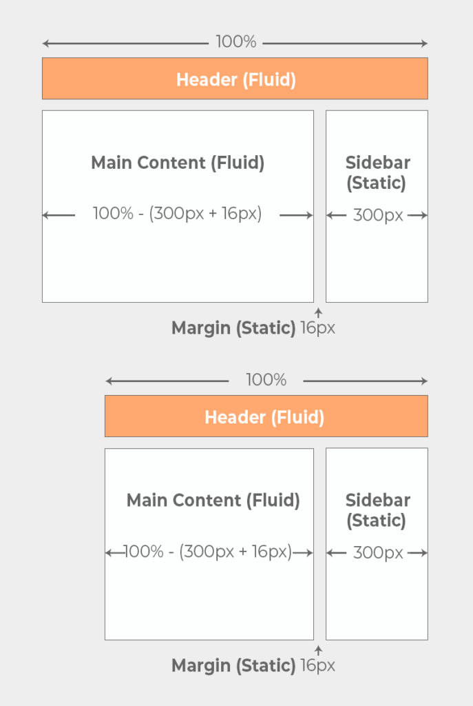
By definition, comparing static elements with fluid elements would never result in a proportionate design because they do not scale at the same rate. However, users typically don’t switch devices while experiencing your UI.
With this in mind, it is possible to use proportion in UI Design. However, it just might not be the way you would expect.
Units of Measurement in UI Design
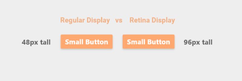
You’ve likely heard the term “pixel” used most often as the unit of measurement for digital products. This was generally acceptable until 2010 when Apple introduced the Retina Display.
The Retina Display changed the way we thought about “size” by packing in twice as many pixels per square inch of the display. While the size of an element between a Retina and non-Retina appear to be the same, the total number of pixels that make up that element is way different. For example, a button that is 48px tall on a regular display would now be 96px tall on a Retina Display because of the pixel density.
Since then, many different High Pixel Density (HPD) screens have become available across many different brands and devices. Fortunately, HPD screens are typically defined by how many more pixels fit per square inch than the standard 1X pixel density display.
For example, most screens can be described as having a 1X, 2X, or 3X pixel density.
The term “pixel” is still commonly accepted to describe the size of an element. However, to avoid confusion, many designers prefer to use the term “point” or “pt,” which describes size, regardless of the screen’s pixel density.
For the remainder of this lesson, we’ll use the terms “pt” and “px” interchangeably as the unit of measurement to describe the relationships between elements in our design.
The 8pt Grid System
When working with design software, such as Illustrator, Photoshop, Sketch, XD, Figma etc. it’s very common for designers to use grids or columns to assist with their design efforts. Many of the principles of design discussed in this course can be achieved with the help of grids or columns, so it’s no surprise that they are a popular tool in the designer’s toolbox.
However, there is one particular strategy, that works exceptionally well for proportion. This strategy is known as the 8pt Grid System.
The 8pt Grid System was first introduced by Google’s Material Design specification. Fortunately, it’s fairly easy to understand. Essentially, you want to use a grid that is composed of 8 x 8 pt squares. As you design on top of this grid, you’ll want to ensure that all elements snap to the grid.
This results in elements with dimensions that are always divisible by 8. By designing in this way, it’s easy to keep elements proportionate, while creating a sense of vertical rhythm throughout the design.
Why 8 Points?
The 8pt system is the most widely adopted for two primary reasons:
- The most common screen dimensions are divisible by 8, making your designs very crisp and clear on the majority of devices (no split pixels).
- The recommended base font size on the web is 16px. This allows developers to scale elements on a web page in REM units while staying true to the grid system.
Overall, there are more benefits for using 8 points as opposed to any other number for the grid. However, you can use a number such as 10pt or 12pt if it better suits you.
Why Not 4 Points?
The Google Material Design spec DOES recommend using 4pt for “Smaller components, such as iconography and typography.” However, the majority of UI elements can still be handled by the 8pt system, so it’s more popular to start with.
The Golden Ratio
The 8pt Grid System has its clear advantages in UI design, but if you do a quick Google Search for “Proportion in UI Design” you’ll be met with a front page full of results regarding the Golden Ratio.

The Golden Ratio is [roughly] 1:1.618 and is believed to be the intersection of mathematics and aesthetic beauty. Many designers ignore grid systems altogether in favor of creating proportion with the Golden Ratio instead.
There are plenty of examples of how the Golden Ratio has been used for everything from the Gutenberg Bible to modern-day logo design to occurrences in nature. However, there others who believe that the beauty of the Golden Ratio is simply a myth.
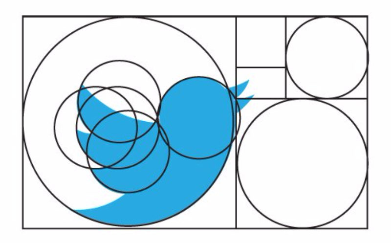
Regardless, there is no denying that many are enamored by the Golden Ratio, so it’s certainly worth mentioning in this lesson.
Using the Golden Ration in UI Design
In lesson 4 of this course we discussed that a design should not have more than 3 to 4 levels of hierarchy in a particular section of the UI. With this in mind, you can apply the Golden Ratio in your design by following these simple steps:
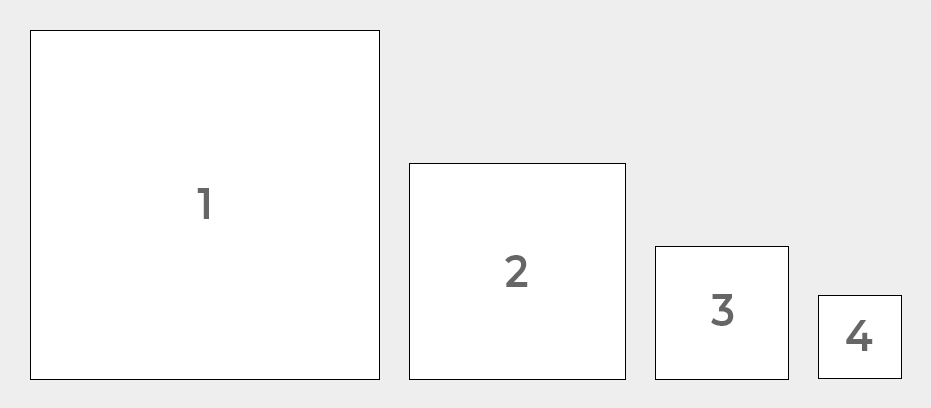
Define the height of a rectangle and multiple that number by 1.618 to find the width. This creates a “Golden Rectangle.”
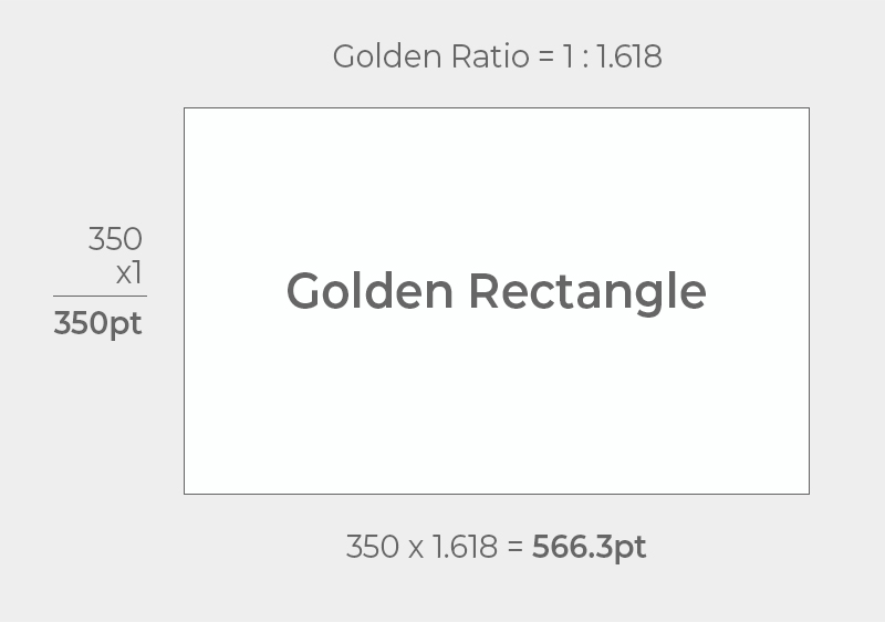
In the example above, our starting number is 350pt, but you can use whatever number you would like.
Divide your Golden Rectangle up into perfect squares. Each perfect square will result a new, smaller Golden Rectangle.
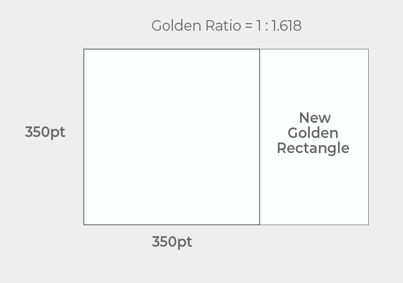
Continue dividing the Golden Rectangle until you have 3-4 different perfect squares of different sizes.
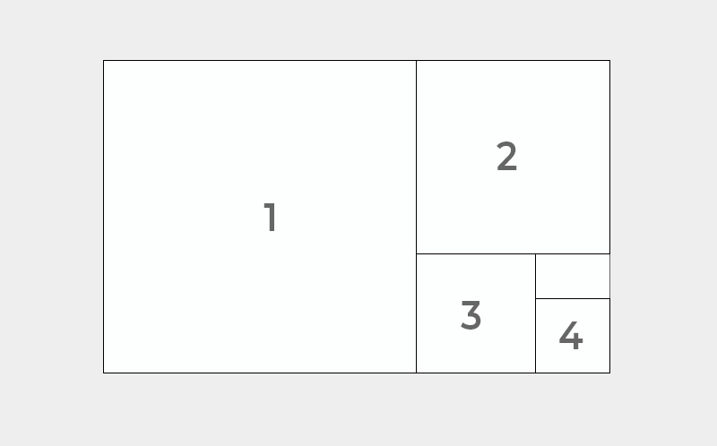
Use the size of each square as a “placeholder” to help break up your layout and communicate hierarchy in your design.
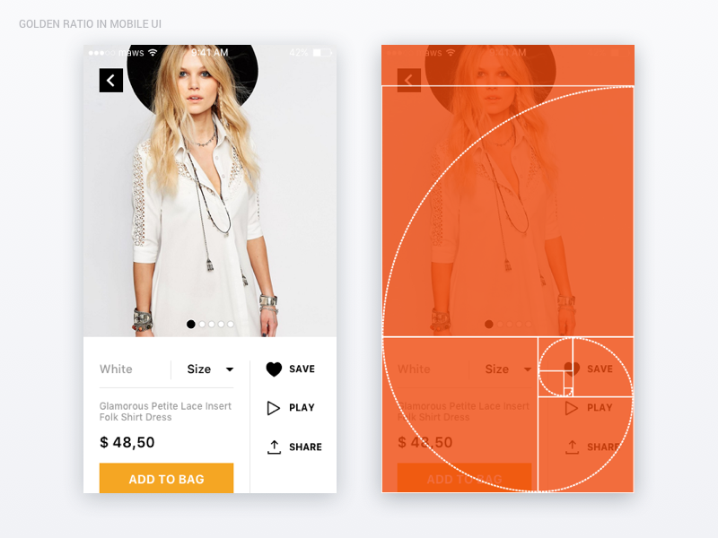
Overall, the result is an aesthetic and proportionate design. Take a look at this example from Prototypr.io.
Starting With Constraints
Now that we’ve covered some methods for establishing proportion in UI Design, let’s discuss some great starting points. By starting with constraints first, it’s easier to build your UI around those constraints.
Mobile First Design
The phrase “Mobile First” was coined by Luke Wroblewski in his book of the same title. The term gained popularity with designers as a way to combat the urge to cram more stuff into a UI simply because there was ample space to do so.
By focusing on mobile design first, designers must work around the constraints of mobile devices and focus on what really matters. As a result, the user’s experience remains consistent between devices, as the main purpose of the UI remains the center of attention.
Font Size
As previously mentioned, the default font size for body text on the web is 16px for most major browsers. Anything smaller than this can trigger some unexpected zooming behavior on Apple mobile devices. As a result, its generally recommended to leave 16px as your base font size and specify your remaining font sizes (headings, small text, captions, labels etc.) accordingly.
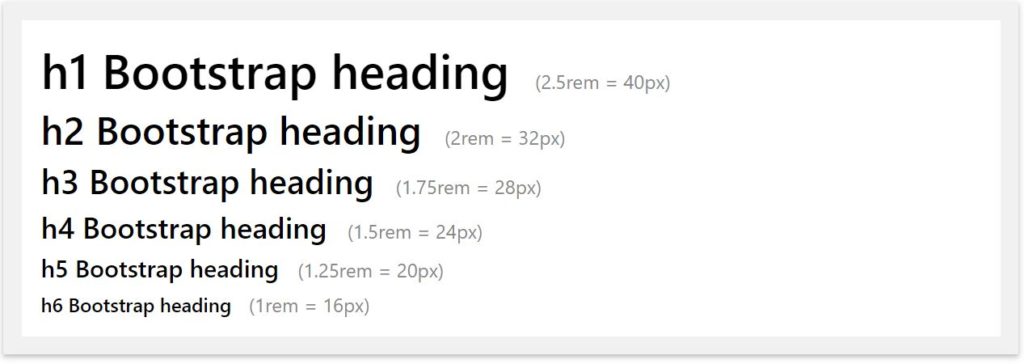
We can define these font sizes with proportion in mind by following Google Material’s Design spec and choosing sizes with increments of 4pt, such as Bootstrap’s style guide for font size.
Note: incrementing your font size by the Golden Ratio is not recommended as the differences between each font size would be far too great. For example, starting with a base font size of 16 and multiplying each heading level by 1.618 would result in a H1 heading of 177.4 pts, which would be very difficult for readability.
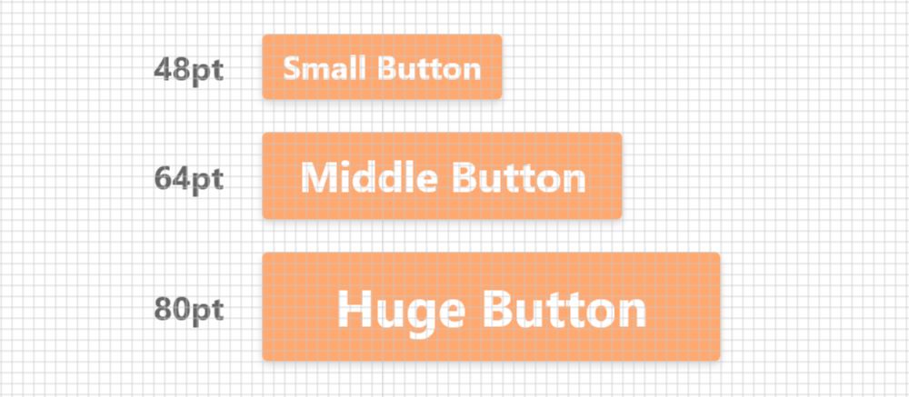
Button Size
Another limiting factor to consider is the precision of the input method that is used on your design. In this particular case, we are referring to fingers, thumbs, cursors, and stylus pens.
Fingers and thumbs are much wider and less precise than cursors or stylus pens. With this in mind, it’s important to make sure the sizes for your buttons, inputs, icons or other touch points are chosen carefully to account for these limitations.
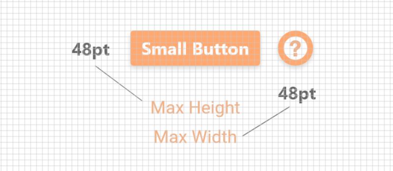
Google’s Material Design recommends that touchpoints on mobile be no less than 48pt tall and 48pt wide with no less than 8pt between them.
Content Width
Content is fluid, which means it fills up as much horizontal and vertical space as it’s able to. Despite this characteristic, it’s good practice to define a minimum and maximum width for your content.
A minimum content width can be determined by the minimum screen width that your design will support. The smallest screen resolution that most designers support is 320px (that’s at 1X) wide. However, you should choose your minimum width based on real user data if you are able to obtain it. Google Analytics is a good place to look for this type of data.
While content width can fill up as much screen as its given, it’s generally not recommended to allow your content to span more than 52 characters per line. This would suggest that the maximum width of your content can be determined by using actual body text at its normal font size and finding a comfortable content width that fits this range.
Conclusion
In conclusion, proportion is a useful design principle. Despite having a combination of static and fluid elements, a proportionate UI can still be achieved by using an 8pt Grid System, the Golden Ratio, or another method. As you begin defining the dimensions of elements, it’s common practice to start with your constraints, such as device, font size, button size, and content width. After your base sizes are defined, it’s much easier to scale elements accordingly.
Next Lesson
Principles of Design: White Space
Previous Lesson
Principles of Design: Emphasis
Principles of Design
- Lesson 1: Unity
- Lesson 2: Balance
- Lesson 3: Alignment
- Lesson 4: Hierarchy
- Lesson 5: Emphasis
- Lesson 6: Proportion «
- Lesson 7: White Space