Principles of Design: Balance
2018-11-13Balance in design refers to an even distribution of visual weight. A lack of balance can lead to visual tension, which can make or break a design. Balance can be achieved with symmetric, asymmetric, radial, or mosaic approaches.
Introduction to Balance
The word “balance” is used in many different contexts. Whether it’s used to describe your diet, the judicial system, or standing up on your own two feet; balance is normally considered a very good thing. In the vast majority of cases, nobody wants to lack balance in anything.
The same is true in design. Balance is desirable.
In the physical world, objects of the same physical weight will balance each other on a scale. In design, balance refers to the distribution of visual weight.
Visual Weight
Considering their relative size, a basketball and a bowling ball appear to weigh the same. However, our experience tells us otherwise. We know that the physical weight of a bowling ball is much heavier than a basketball.
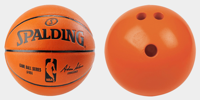
In design, however, we are limited to our perception. Although they differ in physical weight, the image above remains visually balanced because both objects compete for our attention equally.
Visual weight is the perceived weight of an element in your design. It is a measure of how much an element stands out compared to those around it.
Factors of Visual Weight
Visual weight can be altered by the size, color, contrast and/or the density of an element. Assuming all else is equal, let’s see how each of these factors have an impact on visual weight.
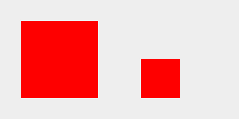
Visual Weight by Size
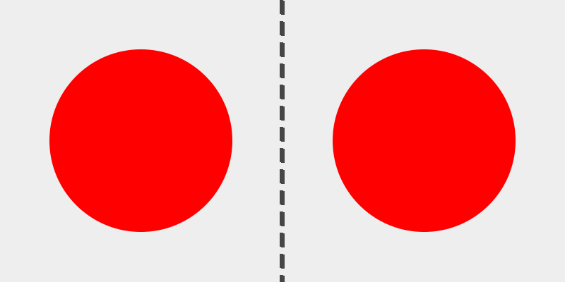
Size is the most obvious factor that contributes to visual weight. In the image below, the left square carries more visual weight than the right square.
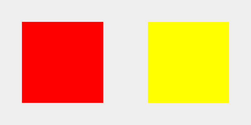
Visual Weight by Color
Color is a less obvious contributor to visual weight. Our perception of color is relative to the colors around it. In the example below, the red square demands our attention, giving it more visual weight than the yellow square. However, as we’ll see in the next example, this is not always true.
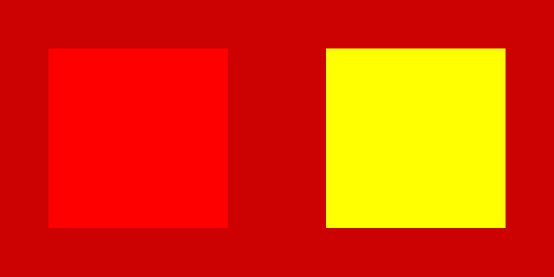
Visual Weight by Contrast
By using the same colored squares as the previous example, we can see how contrast can drastically change our perception of color. A darker red background reduces contrast for the left square and increases contrast for the right square. This effectively switches our focus to the yellow square.
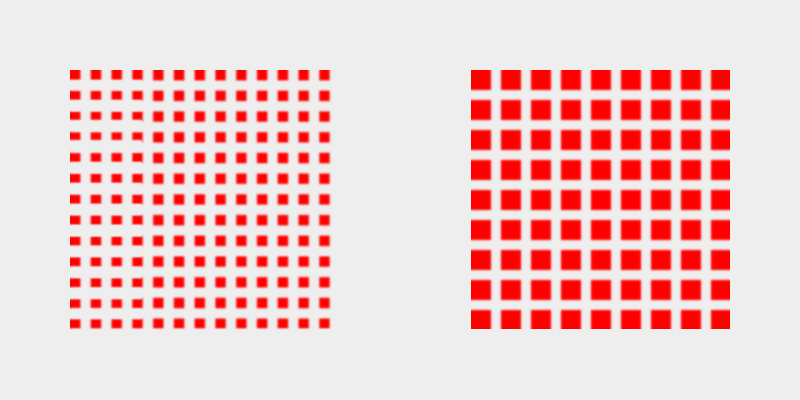
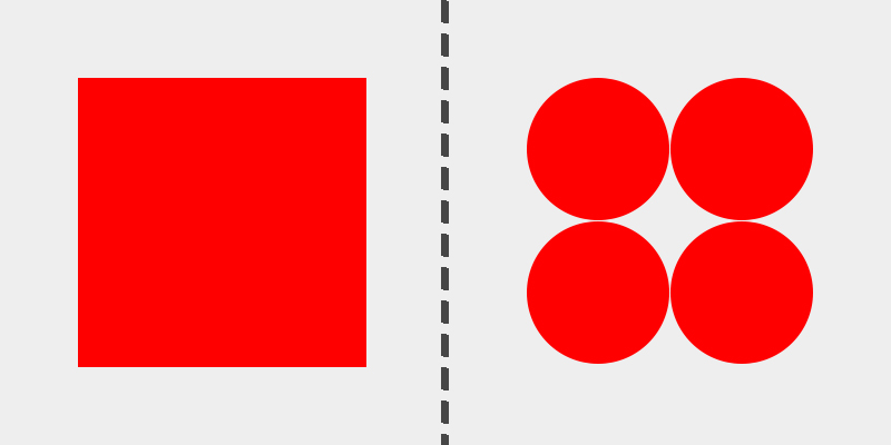
Visual Weight by Density
Despite both squares having the same overall size, color, and contrast, the right square has more visual weight due to it’s perceived density. This example illustrates how white space can play a role in creating balance.
In each of these examples, we can see how slight changes to the size, color, contrast, or density can affect the visual weight of an element on your page. As we’ll see below, these factors can be combined to help establish a sense of balance with your design.
Balance vs Tension
Without balance we create visual tension that can easily have a negative impact on how our designs are perceived by others.

The image above has been edited to appear unbalanced. The centered text establishes a symmetrical balance on a vertical axis. However, the left side of the page is visually “heavier,” which creates visual tension. This visual tension causes our brains to think “something seems off about this design.”
The actual design has visual weight distributed evenly on both sides of the page.

Most would agree that the second image is more preferable than the first because our brains desire balance over tension. This doesn’t mean you should avoid creating tension altogether, but it should be used with caution and intent.
Balance and tension are not mutually exclusive. Using the same example above, a designer may wish to draw more attention to the right button than the left, without upsetting the balance. This primary / secondary relationship between buttons is nothing new. We can avoid creating too much visual tension by combining the factors of visual weight.
In this case, Unbounce’s primary color is orange. A designer may go through the following decisions to establish both balance and tension simultaneously.
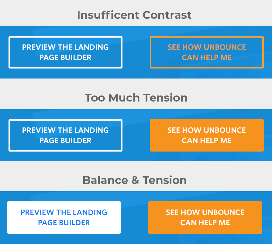
The first change results in an imbalance of contrast. Not only is it more difficult to read the primary button, but the secondary button seems to carry more visual weight. That’s not what we want.
In the second change we have fixed our contrast issue, but the primary button now feels far too heavy compared to the secondary button.
In the third change we have adjusted the density of the secondary button to match the primary button. This results in the right amount of balance and tension that we’re looking for.
Four Types of Balance
There are four ways to achieve balance with design. Most often, balance is established on two sides of an invisible axis, whether vertical or horizontal. This implies the visual direction of your design. While vertical and horizontal balance is more common, it can also be established with diagonal, or even multiple axes too.
Symmetrical / Formal Balance
We observe symmetry in many difference aspects of nature, such as in human faces or butterflies. Symmetrical (aka formal) balance is accomplished by mirroring objects on one or more axes. Below is an example of reflective symmetry, in which two objects mirror each other on a vertical axis.
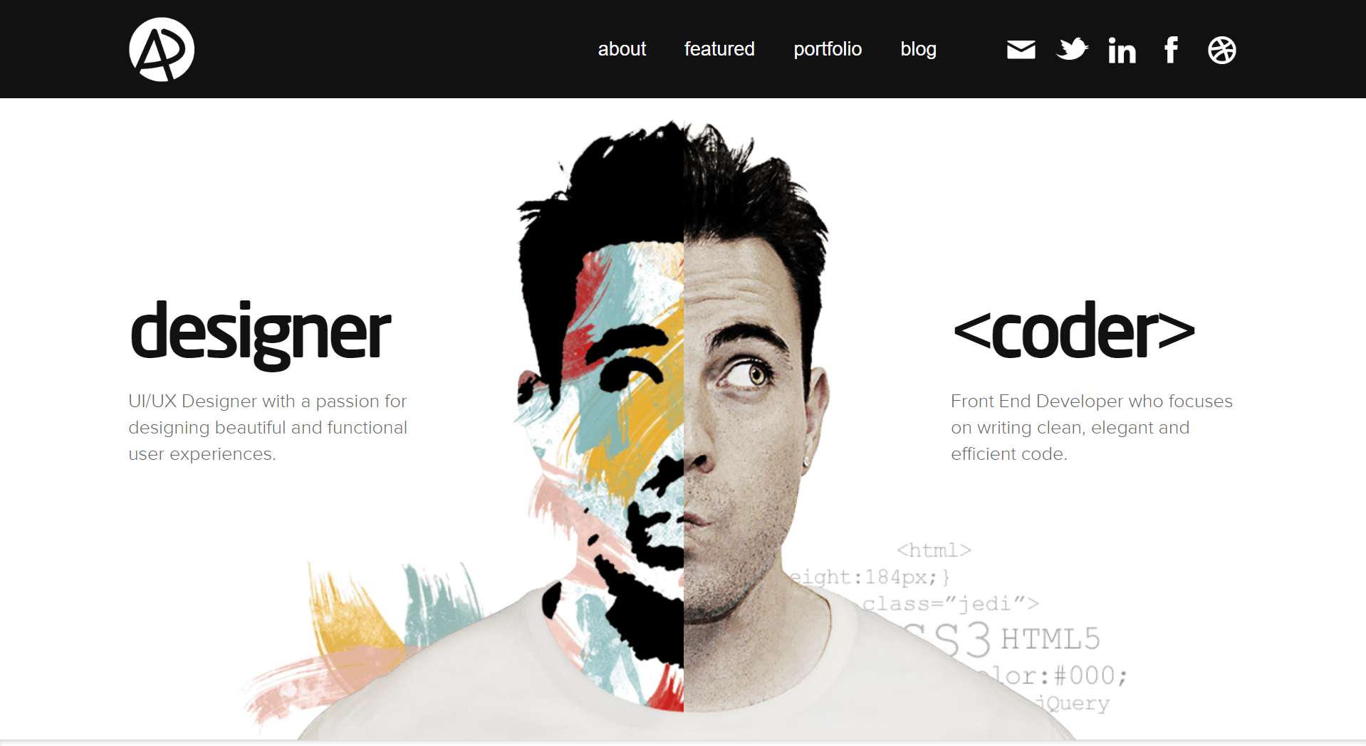
Symmetrical balance is often used to express a sense of grace, elegance, or formality. However, too much symmetry in a design can become dry and boring. In the example above, Adham Dannaway utilizes symmetrical balance, while distinguishing both sides enough to keep things interesting.
Asymmetrical / Informal Balance
We experience asymmetry in nature too, such as with trees or rock formations. By definition, the word “asymmetry” suggests a lack of symmetry. However, balance can be created with asymmetrical elements as well.
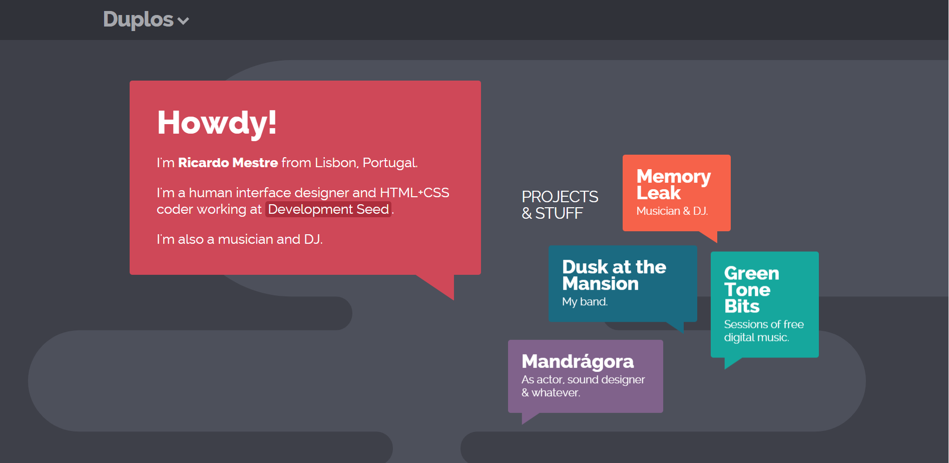
In contrast to symmetry, which can be a bit monotonous, asymmetry can be used to make a design more dynamic and lively. In the example above, Ricardo Mestre pulls off a pleasant and coherent design with asymmetrical balance.
Radial Balance
Radial balance is established when elements appear to radiate from a central focal point. This method can be used to draw attention to the center of your design.
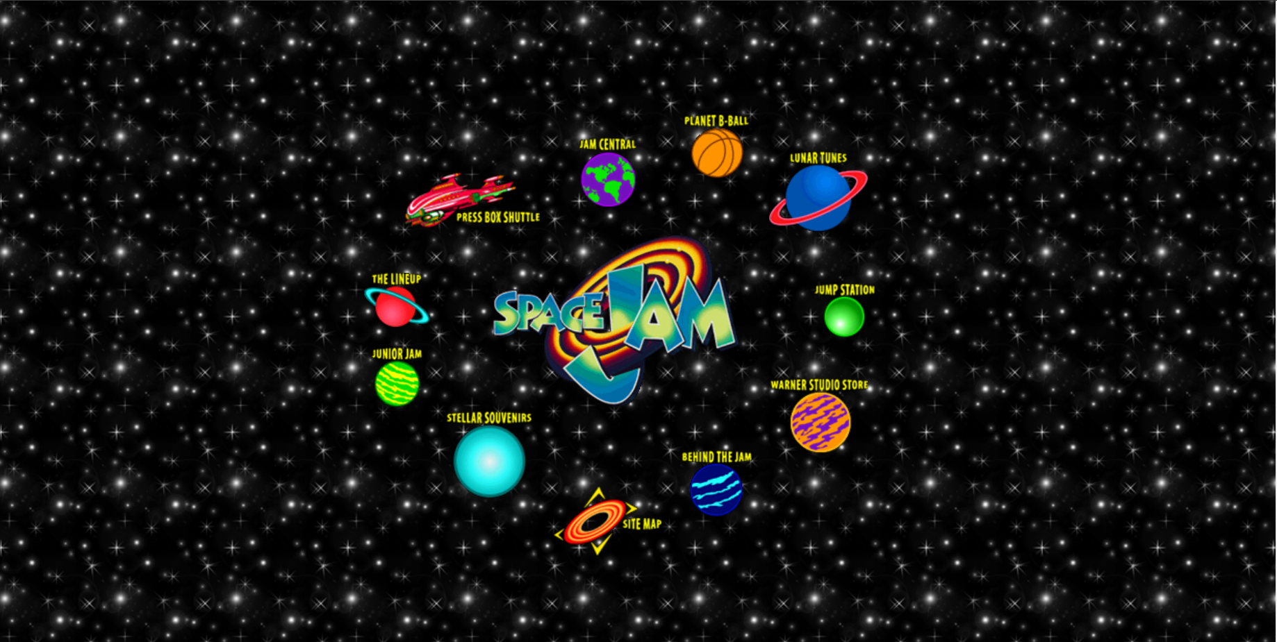
In 1996, Space Jam launched their website, featuring a radial balanced design. The Space Jam logo is the center of attention with navigation radiating from it. Radial balance is less common in UI design today, but that shouldn’t stop you from attempting to master it!
Mosaic / Crystallographic Balance
Mosaic (aka crystallographic) balance can be described as “organized chaos.” It can present itself as pattern or repetition, in which no single element stands out more so than the rest.
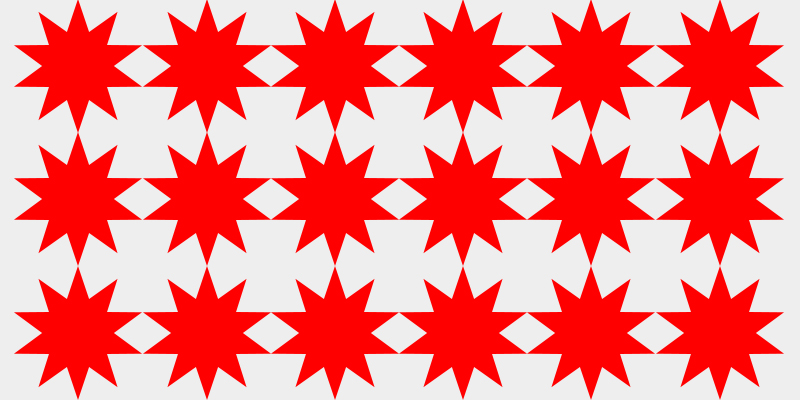
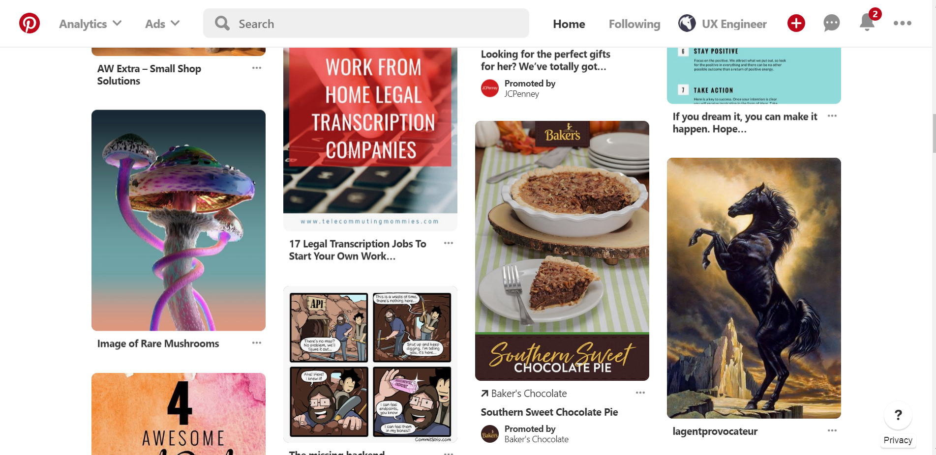
Pinterest’s masonry layout is one such example of mosaic balance. A lack of vertical alignment between elements feels a bit chaotic, but the horizontal alignment and consistency between elements helps to organize that chaos.
Conclusion
When everything is balanced, harmony is created. Balance in UI design is important to achieve a sense unity in your overall design. A lack of balance can result in visual tension, which should be avoided in most cases. However, if done carefully, visual tension can be used to achieve a desired result.
When designing a layout, take a step and ask yourself if the overall composition feels balanced. If one elements draws too much attention, you can experiment with size, color, contrast, or density to help redistribute the visual weight.
There are four types of balance in design. Symmetrical, asymmetrical, and mosaic balance are more common in UI design, but that shouldn’t deter you from trying to master a radial balanced design. Each type of balance can be mixed and matched to make a design more dynamic and lively.
Next Lesson
Principles of Design: Alignment
Previous Lesson
Principles of Design: Unity