Good UX = Boring UI. Don't Be Creative
2018-10-23Most people associate the word “design” with “creativity,” so it’s tempting to believe that a successful UI is the result of creative genius. From a holistic perspective, creativity is necessary for innovation. However, from a user’s perspective, creativity just gets in the way.
The best user experiences are often found on the most boring interfaces. Let’s talk about that.
When the web was “creative”
From the user’s perspective, there have only ever been two eras of the world wide web:
- The Pre-UX Era
- The Post-UX Era
In the beginning, WWW stood for the “Wild Wild Web.” There seemed to be no rhyme or reason for many of the design choices back then.
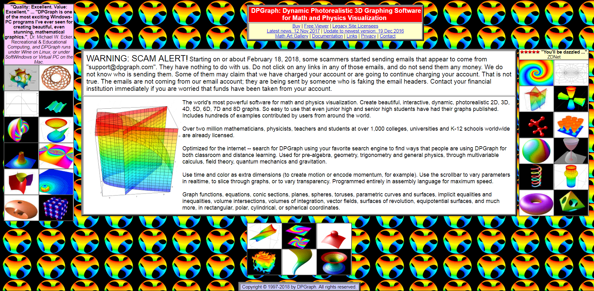
DPGraph: Dynamic photo-realistic 3D graphing software
Websites like the one above (it actually still exists today) were very common in the 1990s. This “creative” type of design was the norm, but we didn’t care. The internet was new and exciting. Hunting down a link among a sea of animated gifs was part of the fun.
Back then, UX was about experiencing the world through this new medium. We just wanted the internet, we didn’t specify how we wanted it delivered.
But that didn’t last long.
Just a touch of UX
The only real expectation we had as users, was the ability to explore the internet. Lycos was there to meet that demand.
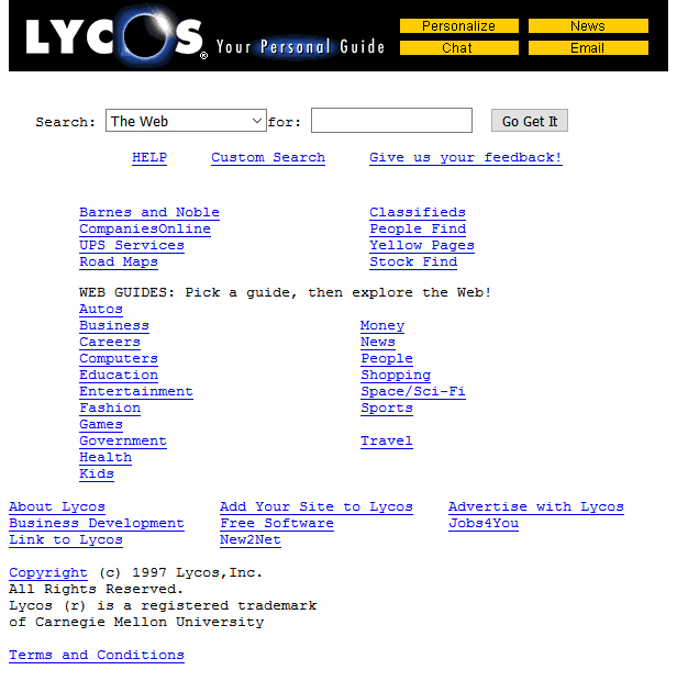
Lycos was a bit clunky and slow and cluttered with stuff that was irrelevant to our needs, but that didn’t matter. It allowed us to see the world, just like we asked.
Shortly after, Google came along. It was plain and boring and had so much white space! What were they thinking?
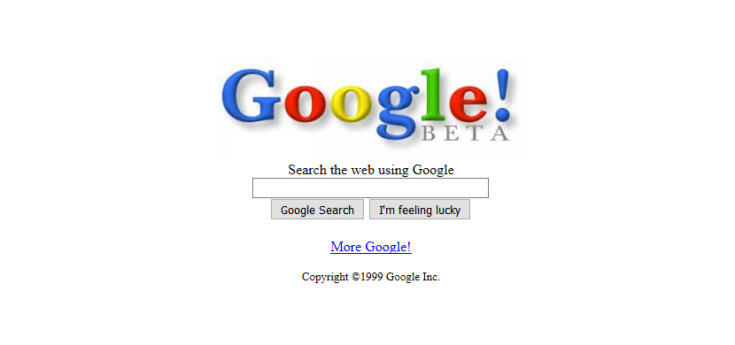
The first time we visited Google, we stared at the screen, waiting for the “rest of the page” to load. We’d grown accustomed to waiting for more links, more images, and more gifs. We waited for more creativity, but it didn’t come.
It didn’t take long to realize that we didn’t need all of that extra stuff. If we wanted to find anything on the internet, we could now just go to Google and find it…really, really fast. There was no hassle, no distractions, and no waiting. We could simply type whatever we wanted and Google would find the most relevant and useful information for us.
For many, this was our first encounter with a great user experience by design. Google’s user-centered approach is the primary reason why we’ve long forgotten about Lycos and the other alternatives. Google understood our needs and pain points before we even knew we had any.
Creativity is bad for UI design
Many people become designers because they want to express themselves creatively. That’s a perfectly legitimate reason for most designer roles, but not with UI design. Users don’t come to your website to admire your creativity. They come to solve a problem.
Obviously, there are many more factors that have contributed to Google’s success than its minimalist design, but that doesn’t derail us from the point. Look at all of your favorite products today and you’ll notice that most of them have one thing in common: a boring user interface.
We see the same UI patterns used over and over again. The biggest discrepancies we find between products is with their branding, where creative expression is carried throughout consistently. Everything else has been molded by our expectations of how things should look and function.
Science says average is beautiful
Research has shown that we find average faces to be the most attractive. In this case, average doesn’t mean 5/10 on the “good-looking” scale. It means the mathematical average of facial features, including the distance between their eyes, the position of their nose and mouth etc.

Amber Heard: The world’s most beautiful woman, according to science
We find average faces to be the most attractive because they are easier for our brains to process.
The same is true for UX/UI design.
Since the Pre-UX Era of web design we’ve watched websites become increasingly similar as standard web conventions have been formed and adopted. Some of these include:
- Call-to-action buttons above the fold
- Search bar in the header
- Logo at the top-left or top-center of the page
- Social media icons in the footer
Most websites follow these conventions, resulting in user expectations for everyone else. Breaking these conventions, for the sake of “creativity,” only leads to confusion. The more average your design is, the less time it takes your users to process it.
How to use that creative energy
The web is moving to closer and closer to a shared design language. The latest design trend is to have no design at all. Minimalism is at the forefront of modern UI design.
It seems that perfection is attained not when there is nothing more to add, but when there is nothing more to remove.
- Antoine de Saint Exupéry
For some, this news is disheartening. Companies are increasingly adopting Design Systems that all but eliminate a designer’s ability to express their creativity. But this is a good thing. With less focus on the “I” in “UI,” designers have more time to focus on the “U.” At the end of the day, the user is what really matters.
Conclusion: Good UX = Boring UI
Stick to boring. Fight the urge to get creative. If you want your product to stand out above the rest, then be average with your design. The only way to truly stand out is to go above and beyond for your user. Use your creative energy to focus on solving their problems better than anyone else can.


